(USTs 'marginally lower', belly leading on above avg volumes)while WE slept; 2yy 'shooting star' and long bonds vs 4% line in the sand as "Bond markets WANT to break free"
Good morning … last time I will try and end on a positive note. Serves me right!! Thanks, Neil! :) … But then, ADP was good …
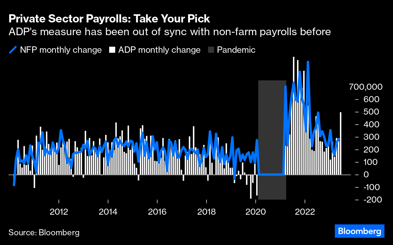
ZH: WTF! ADP Reports Massive Surge In Employment In June
… BUT in this world where good = bad, well, EVERYTHING didn’t work yesterday.,,
ZH: Strong Jobs & Hawkish FedSpeak Spark Early Chaos Across Markets
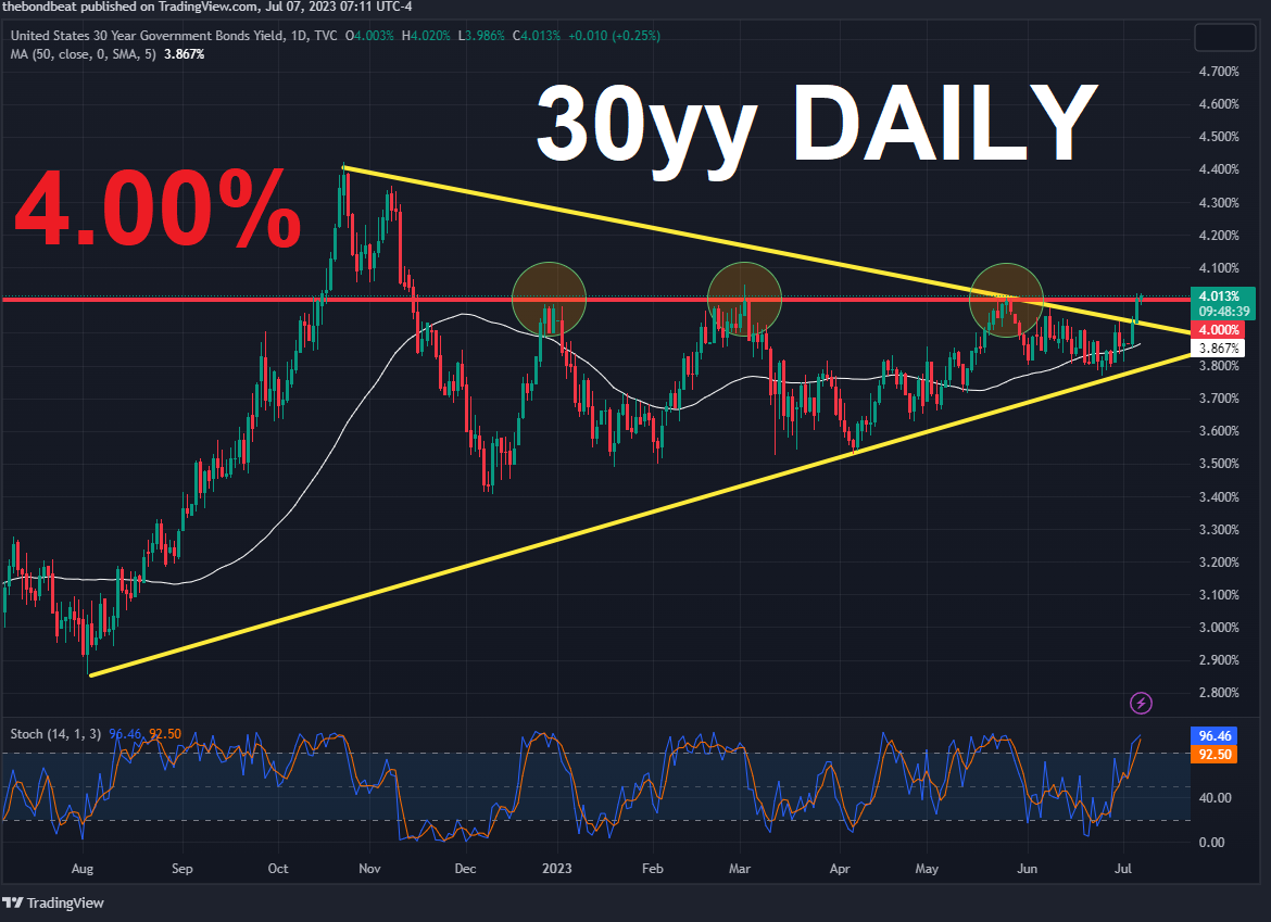
More on all this in a moment but first, a look at long bonds which are clearly ‘breaking free’ …
I’d note clearly that 4% is the (very next)LINE IN THE SAND (until it too needs to be redrawn after the waves of sellers crash upon the shores … more below) and before redrawing that TLINE, kindly note how oversold (stochastics, bottom panel) long bonds are. AND … here is a snapshot OF USTs as of 712a:
… HEREis what this shop says be behind the price action overnight…
… WHILE YOU SLEPT Treasuries are marginally lower with the belly leading rates higher again overnight as Treasury benchmarks press key range supports ahead of NFP (see attachments). DXY is lower (-0.2%) while front WTI futures are higher (+0.5%). Asian stocks were lower, following NY prices, while EU and UK share markets are mixed this morning. ES futures are little changed here at 6:55am. Our overnight US rates flows saw Treasuries in a sideways chop during Asian hours with front-end selling pressure persisting amid decent volumes then. In London's AM hours we saw orderly flows as a rally attempt was relatively quickly snuffed out with little interest seen to fade the cheapening in the belly. A TU/TY steepener was added via futures blocks, lending support to the front end. Overnight Treasury volume was decent at ~130% of average overall with 2yrs (213%) and 30yrs (168%) seeing some relatively elevated turnover this morning…
… Treasury 2yrs, daily: 2yrs took a look above their March move highs yesterday, finding buyers there despite a brace of block TU sales early in the session. Indeed, yesterday's price action traced out a so-called Shooting Star candle which is a [bear] trend exhaustion (not reversal) signal. 2yrs have been locally 'oversold' since the end of May so perhaps new yield highs were warmly greeted by a presumably large short-base? Right or wrong, do note in the lower panel that daily momentum has finally flipped bullishly (circled); a sign that the 2y buyers have re-asserted local control over the sellers. We'll be watching to see if what happened yesterday was a 'pause that refreshed' in a relatively steady bear move or... is the beginning of a more sustainable corrective move back to, say, the 4.80% range high from mid-June.
… and for some MORE of the news you can use » IGMs Press Picks for today (7 July) to help weed thru the noise (some of which can be found over here at Finviz).
I’ve got to pause and insert one last ‘news’ item with yesterday afternoons 4p data
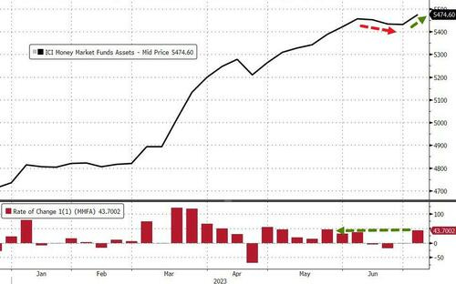
ZH: Money Market Fund Assets Hit New Record High As Inflows Resume; Fed Balance Sheet Shrink Accelerates
… For the first time in four weeks, aggregate money market funds saw inflows this week. After 3 weeks of small outflows, the $43.7 billion surge sent money market fund to a record $5.47 trillion...
However, as we have previously noted, retail fund flows never stopped increasing and now institutional fund inflows have resumed (as we move through the corporate tax day).
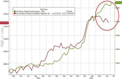
This exaggerates the decoupling between 'rising' (seasonally-adjusted) bank deposits and rising money market fund assets...
From some of the news to some of THE VIEWS you might be able to use… here’s what Global Wall St is sayin’ … Keeping in mind, these final few moments just before NFP, not sure how much ANY of this matters.
DataTREK: JOLTS Supports More Rate Hikes
…Here are our 3 takeaways from the latest JOLTS data:
#1: Job openings fell (-496,000) in May to back below 10 million by almost as much as they rose (+575,000) in April, and openings’ edge over the number of unemployed workers narrowed as a result.
Takeaway: Job openings outnumbered unemployed workers by 1.6x in May versus 1.2x in February 2020, reflecting a still tight US labor market as shown by today’s ADP print but also one where demand continues to slow overall. April’s jump and May’s decline in job openings show how choppy this data can be month to month, but openings have fallen from a high of 12.0 million in March 2022 to 9.8 mn this past May. Available positions need to drop by another 2.8 mn (9.8 mn currently vs 7.0 mn in February 2020) to get back to immediately pre-pandemic levels, and they’ve already fallen by 1.4 mn during the first 5 months of this year. Chair Powell sees the historically large difference between openings and unemployed workers as driving wage inflation that feeds into overall price inflation, so he will likely stay hawkish until this gap narrows closer to pre-pandemic levels.
#2: Quits jumped to back up above 4 million in May, while layoffs and discharges only fell slightly. Here is the detailed quits/separations data:
Takeaway: Our “Take this job and shove it” indicator climbed in May due to a rise in quits (+250,000 to 4.0 mn) and slight fall in layoffs and discharges (-35,000 to 1.6 mn).
#3: Hires as a percentage of the workforce had been rolling over to early 2020 levels but has edged higher the past two months. Here is the detailed hires data:
Takeaway: Hires as a percent of the workforce is still at the upper band of prior cycle levels over the last 2 decades and is heading higher of late.
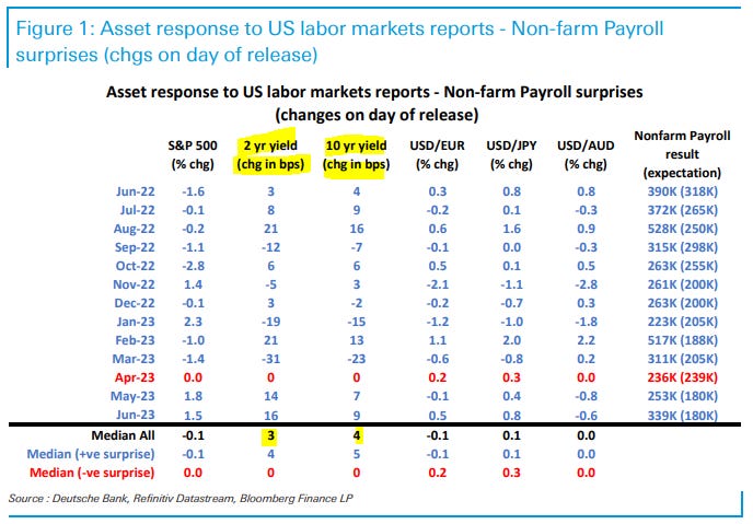
Bottom line: Today’s JOLTS report showed some slowing in the US labor market but highlighted that it still remains very tight relative to history…In other words, if you need a reason as to why Fed Chair Powell continues to signal more rate hikes ahead, look no further than JOLTS. Between today’s JOLTS and ADP data, the nonfarm payrolls report out tomorrow could easily exceed expectations of 240,000 after a gain of 339,000 in May.
The multiple strong US labor market numbers on Thursday seem to have lifted the NFP 'whisper number' and likely taken some significant upside potential out of the USD, opening up a little more USD downside on any softer-than-expected data.
On a downside surprise that does not look streaky, the USD is vulnerable to giving back most of its gains against those currencies that were the biggest losers on Thursday, with the BRL, ZAR and MXN among EM's liquid currencies having the most to gain, while NOK, AUD and CAD should outperform the most in G10.
In contrast, on stronger-than-expected data, yen cross pairs like MXN/JPY, BRL/JPY, IDR/JPY would likely see significant additional downside pressure, as favorite carry trades come under even more acute positioning pressure.
We estimate nonfarm payrolls rose by 250k in June (mom sa). Job growth tends to pick up in June when the labor market is tight—reflecting strong hiring of youth summer workers—and all four of the Big Data indicators we track indicate a strong pace of job growth. On the negative side, the June seasonal factors have evolved to become more restrictive in recent years, which could offset some of the summer hiring tailwind.
We estimate the unemployment rate pulled back by one tenth to 3.6% (consensus also 3.6%) reflecting a rise in household employment and unchanged labor force participation at 62.6%. We estimate a 0.3% increase in average hourly earnings (mom sa) that lowers the year-on-year rate to 4.2%, reflecting waning upward wage pressures and neutral calendar effects (consensus also 0.3% / 4.2%).
Wells FARGO U.S. Nonfarm Payrolls Forecast Revision
Incorporating updated information, we have revised our forecast for June nonfarm payrolls to 260K from 245K.
Please note, our forecasts for June's unemployment rate and average hourly earnings (MoM) remain the same at 3.6% and 0.3%, respectively.
Yardeni: Hot Job Reports Hit Stocks & Bonds Like A Bucket Of Cold Water
The job market is still hot despite the 500bps increase in the federal funds rate since March of last year. Today's batch of strong labor market reports turned investors cold on stocks and bonds. Good news for workers is bad news for financial markets if it means that the Fed will continue to raise interest rates. In addition, it gives hard-landers another spin: The economy may be strong now, but that will boost inflation, forcing the Fed to cause a recession to bring inflation down. We are still disinflationary soft-landers and stock market bulls, targeting 4600 on the S&P 500 by the end of this year.
So much ink spilled on a narrative here and there as it’s about to require an overhaul. I cannot think of a better job other than perhaps a weatherman?
Not to be misleading there were a few things NOT related (directly) TO jobs
BNP US rates: Short 2y SOFR swap spread on liquidity drain
We think front-end swap spreads are susceptible to further tightening in the second half of this year.
MMFs have shifted significantly out of the RRP facility, but increased Fed uncertainty may see a more defensive approach from here.
The deficit coupled with QT will boost supply that needs to be absorbed by other market participants, with inventories likely to accumulate on dealer balance sheets over the coming months.
Trade idea: Short 2y SOFR swap spread…
… We expect a further decline in reserves over the next six months: Although the broad liquidity drain is set to decelerate through the second half of this year, we expect reserves to still decline by over $300bn during this period. We believe this immediate and impressive jump out of the RRP facility was likely driven by funds rebuilding their T-bill allocation after the debt ceiling resolution. Crane data shows that the share of assets held in Treasuries by MMFs has fallen below 16% in May, the lowest since 2014.
The Fed pause in June pushed US swaption vols lower, led by gamma and the upper left corner (ULC) as realized vol retreated.
Payer skew richened versus receivers in June as concern about higher rates has not been extinguished.
In the ULC, realized skew generally underperformed implied skew on days when yields fell in June and more often outperformed when yields rose.
We continue to hold short 18m2y straddles (daily hedged), long 3m10y A/A+50bp payer spreads, and 1y5y5y A/A+60/A+120bp mid-curve payer fly.
I love it when they talk technically of rates VOL rather than direction ... AND for our inner STOCK jockey,
Barclays European Equity Market Review - Rates fever Rates fever has hit summer lull. Frothy equity markets looked vulnerable to a pull back, but rising rates are more due to stronger growth than higher inflation, at least in the US. So equities should be able to shrug it off, as long as Q2 earnings deliver. Growth/Value vs. rates dislocation shows a high price for safety.
… Rates up, but for the good reason. This week’s selloff in US rates is more a product of stronger growth rather than renewed inflation surprises, in our view. In fact, the recent rebound in yields looks consistent with surging economic surprises (strong ISM services, rising manufacturing new orders to inventories, lower claims, strong ADP employment report). Meanwhile, inflation data is actually showing further evidence it is slowing, along with a potentially less tight labour market as well, which feels like goldilocks for equities. But markets which had been hoping for peak rates for some time are finally waking up to the fact that US economy is running strong, which means rates may have to stay higher for longer. Arguably, the situation in Europe is different, with rates moving up despite weaker data and still high inflation readings.
Good data bad news again?
With THAT in mind, I’m going to pause and insert a couple things to consider for us visual learners.
Matthew Timpane, CMT (AT mtimpane for those still using twitter)
One reason for this morning's sharp sell-off is the rise in yields after a breakout -- now back at March 2023 highs After today's ADP report doubled expectations investors are now pricing in a 92% chance of a 25 basis point rate hike in July $TNX
Key Technical Themes: • Strong data last week followed by the Fed minutes this week have seen US and indeed global bond yields surge higher, and this has seen their sideways ranges resolved higher, against our expectations for the US. We now shift to a more negative tactical outlook looking for yields to rise further, especially in the US and UK
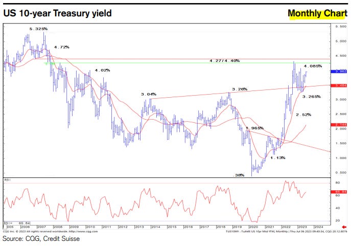
• 10yr US bond yields have broken support at 3.85% and then the 4.085% prior high for the year and we look for this to clear the way for a retest of long-term support at 4.27/4.40%, which includes the 2022 yield high.
• 2yr US bond yields are seen on course to test their 5.30% high of 2006.
• 10yr US real yields have also resolved their range higher, and above the 1.82% high of 2022 would be seen to clear the way for a test of 1.98/2.00%.
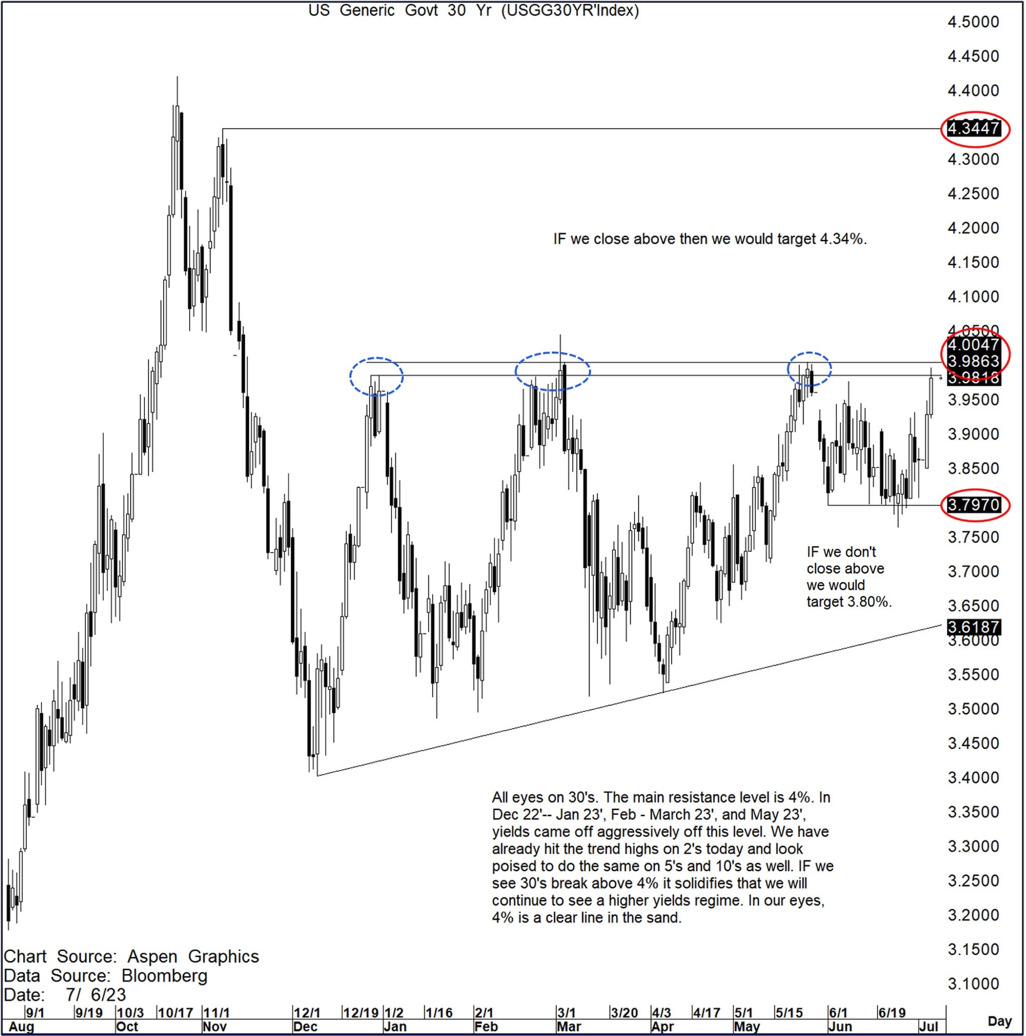
US 30yr Yields: Shout out to our Head US Rates Strategist Bill O’Donnell for pointing this out to me. All eyes on 30’s.
The main resistance level is 4%. In Dec 22’-- Jan 23’, Feb - March 23’, and May 23’, yields came off aggressively off of this level.
We have already hit the trend highs on 2’s today and look poised to do the same on 5’s and 10’s as well.
IF we see 30’s break above 4% it solidifies that we will continue to see a higher yields regime.
In our eyes, 4% is a clear line in the sand.
IF we close above then we would target 4.34%. IF we don’t close above then we would target 3.80%.
4% is the line in the sand
While Global Wall St is saying lots, they are also reading lots on the WWW as well as The Terminal and one such thing likely making the rounds from The Terminal is,
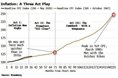
Inflation’s current fall is set to wrong-foot investors as its entrenched nature leads to a re-acceleration in price growth and a secular rise in long-term yields.
It’s not over yet. While headline CPI in
the US
continues to fall from recent highs, the genie is out of the bottle, and underlying structural drivers threaten to re-elevate inflation after the current bout of disinflation peters out.
Bonds are short-term oversold, but longer-term yields are prone to a structural rise as bondholders demand extra compensation for price growth that has become embedded.
Inflation can be thought of as a play in three acts. The 1970s are considered an imperfect analogy for today, but it in fact captures much of the essence of inflationary episodes.
In that period, we had the initial burst of inflation due to overly loose fiscal and monetary policy in the late 1960s. Then there were rate rises and a recession leading to a fall inflation, and a premature belief the worst was over. This was followed by a resurgence in CPI in the mid-1970s, ultimately requiring the Volcker rate sledgehammer to pacify it.
As the chart below shows, Act II in the 1970s lasted about three years.
Today, however, that time period could be considerably compressed - with inflation beginning to rise again in as little as six months - due to three reasons:
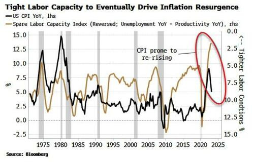
Very limited spare capacity in the labor market
Persistence in elevated profit margins, leading to a profit-price-wage spiral
Stimulus in China provoking a re-acceleration in global and US inflation
Act III in the inflation play will lead to an aversion to longer-duration assets and a structural rise in longer-term yields as term premium prices higher.
Despite 500 bps of rate hikes since last year, the unemployment rate remains near its historical lows. Productivity is depressed too. Together that means spare labor capacity in the US is as low as it’s been for at least 50 years. As the chart below shows, this likely limits how far inflation can fall before labor-market tightness rekindles it.
When this happens depends on where the inflection point is on the Phillips curve (unemployment versus inflation). The notion of a linear Phillips curve is long gone, with reams of research showing a non-linear relationship between prices and joblessness (e.g. here and here).
Today we are on the steep part of the curve, where inflation can fall without leading to a rise in unemployment. But if inflation does not fall far enough to get us to the inflection point - and the flat part of the curve, where unemployment starts to rise while inflation is steady - then it is poised to increase again due to the underlying tight labor-market conditions.
This is what we saw in the mid-1970s. After the initial drop in inflation, CPI soon returned to levels that were consistent with the rising trend in wages and the falling trend in productivity, both of which are present today.
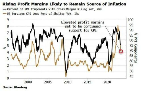
One of the main reasons why the 1970s are not seen as a fit for the present is the considerably lower level of worker unionization. That was the inflation vector that led to the wage-price spiral. But in the current cycle, profits show increasing signs of performing that role, feeding a profit-price-wage spiral.
There are several ways of looking at profit margins, but all of them show a marked increase since the pandemic. The US PPI report estimates the margins of sectors across the economy. As the chart below shows, the percentage of sectors with rising margins on an annual basis has fallen from its peak but remains elevated, and this is consistent with inflation remaining supported.
Profit margins could of course fall all the way back to their pre-pandemic levels, but it’s unlikely. As a recent article from the Institute for New Economic Thinking highlights, when the initial cost-push shock is large (as the commodity rise was in 2020/21), it can lead to persistent price rises, as prices across sectors adjust to the input-cost increase at different times.
Companies are constantly trying to catch up with price increases from other companies.
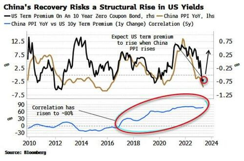
What might be the catalyst for profit and wage-led inflation to be revived? A prime candidate is China. It is the core driver of global inflation, and its halting recovery is one of the main reasons the disinflation in the US and the rest of the world has been so steady.
CPI is barely above zero in China, while PPI is deflationary. This is not something policy makers in China can tolerate indefinitely as growth stagnates and youth unemployment tops 20%.
China will continue to incrementally ease fiscal and monetary policy, and PPI will soon begin rising again, in as little as six months.
The chart below shows that China’s PPI has become closely correlated with US term premium in recent years, and therefore a rise in PPI threatens to lead to structurally higher longer-term US bond yields as global inflation risks rise.
A realization the inflation play is not over - merely getting ready for the next act - will leave high-duration assets looking ever more exposed, and real assets looking underpriced.
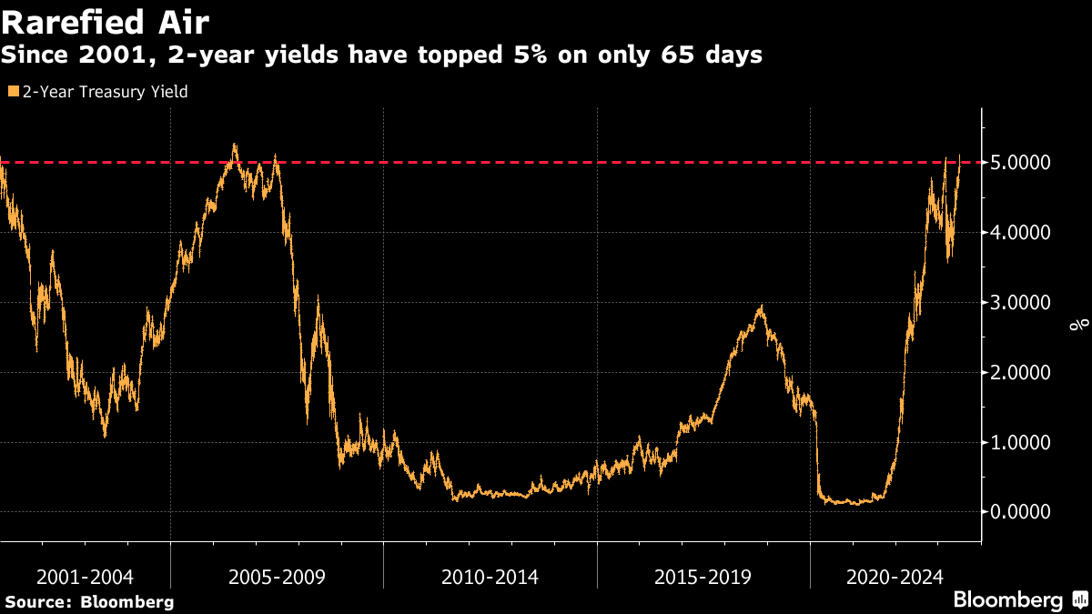
Was this the day that the bond market finally staged a breakthrough? It certainly looks like it on many levels. Perhaps the most startling number came when the two-year Treasury yield topped 5%, and at one point hit a level not seen since June 2007, before the Global Financial Crisis.
Since the 21st century officially started at the beginning of 2001, this was only the 65th day when the two-year yield had traded above 5%. This is unusual; it means that a spike earlier this year can’t betaken as the high for the cycle, and it can’t be ignored:
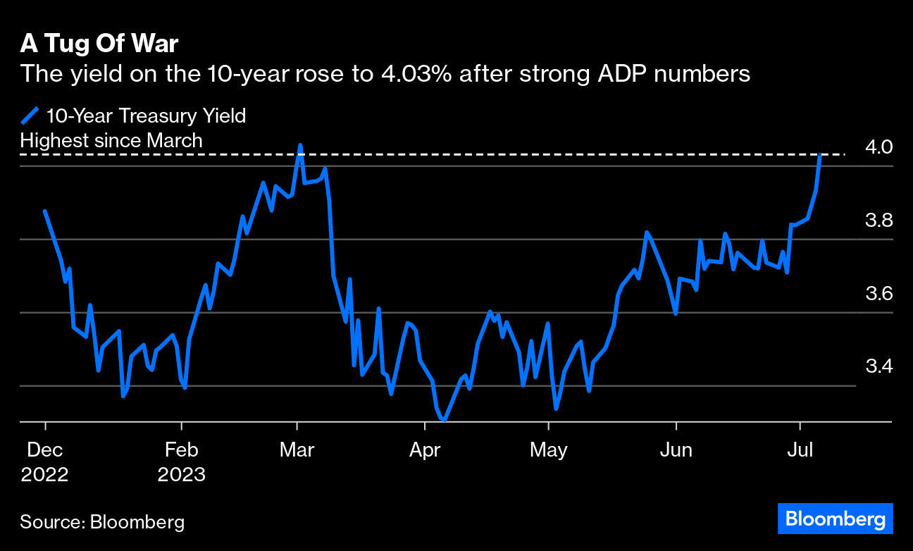
Meanwhile, the yield on the 10-year rose to 4.03%. To Peter Atwater of Financial Insyghts, “Market coils (as prices oscillate)are like a long tug of war. The rope goes nowhere, but there is enormous energy spent until one side or the other exhausts.” Looking at the chart below, it does seem that way — a tug of war between those who thought inflation was licked and those who believed far higher rates would be needed has been going on since US equities bottomed last fall [on Oct. 12] and has now given way.
While the two-year was the most eye-catching and passed a round number, note that there were breakouts across the bond universe. The real 10-year yield is at its highest since the tail-end of the GFC in 2009. German bund yields had their biggest daily rise since the banking crisis in March; with the exception of a few days immediately before that, the 10-year bund yield is its highest since 2011. UK gilts have stabilized above the level reached during the Liz Truss crisis last October, at their highest since 2008.
But traders may be developing cold feet about taking yields to these heights. After a massive early morning selloff as the US economic data came out, the price of the two-year spent the rest of the day regaining lost ground. Much the same was true of the stock market. After an initial shock, there was calm:
The data plainly had an impact, so let’s go there next.
Data Dependence
The trigger for Treasury yields’ spike to levels last seen in 2007 came from the far-stronger-than-expected ADP data on private sector employment sparked bets anew that the Federal Reserve may not slow its monetary tightening pace as inflation proves more persistent. It came in at almost double expectations, suggesting an extra half-million jobs were created last month:
As the chart shows, the ADP data often differs from the government’s official private-sector employment report, which is due Friday. The nonfarm payrolls and unemployment reports may provide further clues on the Fed’s policy path. Economists surveyed by Bloomberg are expecting nonfarm payroll figures to moderate. If the ADP number is anything like accurate, then, that implies that a lot of economists have this very wrong …
… But the overall tenor of the data so far this week is undeniable. The US economy is in much ruder health than thought. Ahead of the critical releases on employment and consumer price inflation over the next few days, the US economic surprise index kept by Citi, which tracks how much incoming data is exceeding or lagging expectations, has jumped to its highest in more than two years:
… What’s Next?
When a market hits new territory like this, it matters. Finance interacts with the real world; higher cost of credit will affect myriads of other decisions in the economy. But exactly what the effects will be can be hard to discern in real time.
As luck would have it, I (and my colleague Michael Mackenzie, also now of Bloomberg) had to write a big analysis for the Financial Times the last time the bond market staged a breakout like this, 16 years ago. Here it is. And in the following chart, you can see what happened next. The two-year yield (and the 10-year yield) only stayed above 5% for a few days. Then, the higher underlying rates made it ever harder to sustain the economics of the structured mortgagevehicles that were proliferating at the time, particularly in subprime credit. Investors started getting out of subprime and pouring money back into bonds. The fuse for the greatest financial crisis of our lifetimes, we now know, had been lit. In terms of financial asset allocation, with hindsight, the correct thing to do when bond yields broke out was to fill your boots with bonds and get the hell out of stocks:
What did people say about this in real time? Thankfully, Mike and I did opine: “The sudden selloff calls the longevity of this era of cheap money and low volatility into question.” We were right about that one. We also quoted Albert Edwards of Societe Generale SA, then as now one of the most notoriously bearish investment strategists, to the effect that this was “the Big One.” Describing bond yields as the “cornerstone” for valuing equities and other securities, he said that if we really were in a new era of steadily rising long-term yields, “all investment portfolios will be shredded to ribbons.”
Of course, it turned out that the long-running downward trend in bond yields had only been very briefly interrupted, and would continue for another decade. But Edwards’s comment still holds good. If yields really keep rising, then very bad things are going to happen to lots of other assets. The alternative is that this bond breakout, like the one in 2007, causes financial accidents that send yields back down again.
So, what are the chances of a mishap? It’s always easy to look for an accident to take place where the last one happened, and that’s a mistake. For example, in 2008, investors mindful of the 1998 implosion of Long-Term Capital Management kept waiting for a systemic hedge fund crash that never occurred. That said, when yields briefly reached these heights in early March, they were immediately greeted by the failure of some medium-sized banks. That whole experience seems like a reenactment of the summer of 2007 on a much smaller scale …
Hope to have something more over the weekend but … THAT is all for now. Off to the day job…