Good morning … With 7yr Treasury auction on tap a review of yesterday’s liquidity event …
ZH: Stellar Demand For 5Y Treasury Auction Despite Lowest Yield Since August
THAT in mind I thought 7yy might be a fine and dandy way to start us off,
TLINE resistance close by and momentum (stochastics, bottom panel) muddling and perhaps on verge of BEARISH (ie higher yield) cross and I’ll just note 40dMA (3.62) as ‘support’ … I suppose, what really matters most will be any / all flow of headlines in / around banks / banking around 1p?
AND … here is a snapshot OF USTs as of 705a:
… HEREis what this shop says be behind the price action overnight…
… WHILE YOU SLEPT Treasuries are a hair lower with the belly slightly outperforming after the first peek at Eurozone April inflation came from Belgium this morning with their flash CPI at 5.6%, down ~100bp from March's 6.67% reading. DXY is little changed while front WTI futures (filled their OPEC+ supply cut gap yesterday) are also little changed. Asian stocks were mostly higher after some solid Tech earnings here after the close yesterday, EU and UK share markets are aggressively mixed this morning while ES futures are showing +0.55% at 7am this morning. Our overnight US rates flows saw on-balance selling from the fast$ community while real$ flows remain light. Overnight Treasury volume was ~75% of average overall.
… and for some MORE of the news you can use » IGMs Press Picks for today (2 APR) to help weed thru the noise (some of which can be found over here at Finviz).
From some of the news to some of THE VIEWS you might be able to use… here’s what Global Wall St is sayin’ …
Summary A revision to prior retail sales data published this week is a potential game-changer. If our interpretation of the latest revisions is correct, then real GDP growth for Q1-2023, which will be reported on Thursday morning, could come in at half the growth rate that is presently expected by the consensus.
The US will deliver an ill-educated guess at how fast its economy grew in the first quarter, with the first estimate of GDP. This number will be revised for years to come, and may well end up having little resemblance to today’s release. None of this will stop the breathless sensationalism of media reporting, nor politicians spinning the data right round (like a record).
What can we actually say about the US economy? We are reasonably confident it slowed in the first quarter. Two years of negative real wage growth has transferred income from consumers to companies, and lower savings and higher credit card debt are now limiting that. However, we also know official data misses more and more economic activity—as people rarely pay more tax than they need to, the positive tax revenue surprises hint at that.
Yet more corporate earnings signal the first quarter was plagued by more profit-led inflation. This is not something that hits the whole economy—it is focused on consumer-facing and near consumer-facing companies…
Turning from GDP and to yesterday’s durable goods — perhaps somewhat LESS than met the eyes?
Wells: Look Past Headline Durables Data, Growth in Core Orders Continues to Slow
Summary The 3.2% pop in durable goods orders in March was due almost entirely to a surge in aircraft orders. It is private-sector core capital goods orders that matter, which show a continued reversal in demand. Nondefense shipments data suggest some modest downside to Q1 equipment spending, which will print Thursday
… The trend in private-sector core orders has slowed and suggests the goods sector of the economy still appears to be going through correction as new demand slows amid increased economic uncertainty. Core durable goods orders (excluding defense and aircraft), slid 0.4% in March, marking the fifth decline in seven months (chart).
From GDP and aDURABLE Goods TO a preview of the upcoming FOMC meeting from MS,
FOMC Preview: Communicating the Pause We expect the Fed to deliver a 25bp hike and communicate a conditional pause. Two-way risk around the next move means the statement will likely reveal a high degree of flexibility. Our strategists maintain 2s30s and 5s30s steepeners, long 5y UST, and long USD positions.
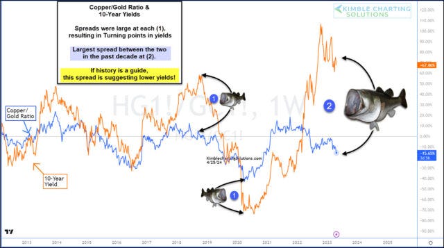
The past two years have seen headlines dogged by inflation and the Federal Reserve’s fight to end inflation.
That fight has seen the Federal Reserve raise interest rates over and over again… and 10-year treasury bond yields have followed suit and risen sharply.
One ratio that we follow alongside the 10-year yield is the Copper/Gold ratio. It often hangs around the 10-year yields trajectory… until the spread gets too out of alignment and bond yields then come back to earth.
Today’s chart shows the last time we saw a “fish mouth” spread at (1) along with the current (and largest in a decade!) fish mouth spread at (2).
So the question is: Will one of the largest fish mouth spreads in the past decade resolve itself in lower bond yields (interest rates)? History suggests so.
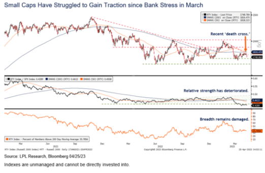
Few, if any, technical analysis patterns have a more ominous name than the “death cross.” This pattern is simply when the 50-day moving average (dma) for a security or index crosses below the 200-dma. While you could look at any market decline and find this cross at some point prior to it, you might be surprised by the results when we look back at these crosses and analyze the performance that followed.
The small cap Russell 2000 Index triggered a so-called death cross on April 21 after the 50-dma had been above the 200-dma for the past 3 months (the opposite cross is called a golden cross, last triggered on January 25, 2023). The Russell 2000 Index has struggled to gain technical traction over the last month after being weighed down by its regional bank exposure following the Silicon Valley Bank failure. A downtrend subsequently emerged off the February highs, further validated by the death cross, as shown in the accompanying chart.
While the name death cross sounds ominous, history shows investors tend to experience more losses before they occur than after. That means this technical signal tends to not work very well for traders who follow it. As shown in the next chart below, performance for small cap stocks has been much better after death crosses than before them.
Once the death cross has occurred, more often than not stocks tend to bounce. We’re not calling for an immediate rebound in small caps by any means, but this data certainly suggests the odds are good the Russell 2000 will be higher six and 12 months out.
As shown in the chart, it takes a modest pullback typically of about 5% within three months for this chart pattern to occur. Once it does, small caps tend to struggle for a month or so before recouping those losses in subsequent months. The median gain of 8.9% six months after a death cross is particularly bullish.
This doesn’t mean this chart pattern should be ignored. If it is the start of a reversal and a new long-term trend, the signal can be effective. Moving average crosses can confirm trend changes even if they are unreliable trading signals based on historical data…
Death cross schmeath cross … lets tackle what is likely soon to be deemed another headfake,
The old investment advice to “Sell in May” is a time-tested seasonal pattern where the US Equity market tends to underperform during the summer months (May – September) and this poor seasonal backdrop leaves us highly concerned just as a range of global equity indices are stalling at key resistance levels. Furthermore, we believe a range of cross-asset markets, from rates to FX, are also portending a period of “risk-off”.
S&P 500 strength has stalled just ahead of the 4195 YTD high and we maintain our view of looking for a top here. Support is seen initially at the 63-day average at 4048, with a close below here needed to see downside pressure increase further for a test of the 200-day average, now at 3961…
… We also believe that the technical signals originating from the rates markets are also pointing firmly towards a phase of “risk-off” through the summer and we maintain our 3% core objective for the 10yr US Bond Yield, with the 2yr US Bond Yield already holding a top and with the 2s10s US Bond Curve expected to bull steepen, which tends to coincide with equity weakness.
While the past five years have brought more than it’s share of big swings, the Value Line Geometric Index remains tethered to the 550 level - yesterday was the 63rd time since 2018 that the index has crossed that threshold.
More details: From its pre-COVID peak to its March 2020 low (which was a level not seen in nearly a decade), the Value Geometric Index fell 46%. It rallied nearly 130% from March 2020 to November 2021. From the 2021 high to the 2022 low, the index was down 30%. But after all that, the Value Geometric Index is back where it started.
Why it matters: Investors, especially those in the US, have grown accustomed to stocks moving up and to the right over time. Zoom out long enough and the data confirms those expectations. But history also reveals extend periods of little or no progress. Adapting our expectations and adjusting our behavior to account for that reality can reduce volatility and make the overall journey less stressful.
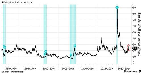
The commodities market’s bellwether for recessions is flashing a warning sign.
As uncertainty circles the markets on whether the Fed is approaching the end of its tightening cycle, the gold-to-oil ratio suggests commodities traders are hedging against the risk of a US recession.
With oil prices down this year while gold is up, the ratio has surged to almost 24, compared with an average of less than 17 since 2000.
Anything significantly above that average is considered as a warning sign by some market participants.
The performance of gold and oil relative to each other is a measure of investor sentiment on the economy, as both assets are cyclical and priced in dollars.
Historically, gold tends to outperform oil during the onset of a recession or great economic uncertainty.
We’ve seen this trend during the global financial crisis, the recession of the early 1990s, and even in what’s known as the mini-recession of 2015-16, though that was due to Saudi Arabia’s oil-price war with the US.
Now, uncertainty about the Fed’s interest-rate path and a potential economic downturn will likely see the the ratio increase even further.


As always, thanks for the comprehensive piece
Thanks for stopping by and letting me vent!