Good AFTERNOON … And happy anniversary of Ali v Liston (version 1.0 Feb 25th 1964 in Miami Beach) … Now if it’s FIGHTS you like, then the FUMBLE in the Treasury bond market jungle on this day, 2021 may ALSO be of interest … Per THE Federal Reserve Board of Governors,
On February 25, 2021, there was an unusual "flash" event in U.S. Treasury markets. The prices of Treasury securities dropped sharply amid strained liquidity conditions, before recovering within about an hour. This event follows several similar episodes in recent years, including the flash event of October 2014, which was discussed in the Joint Staff Report on the U.S. Treasury Market on October 15, 2014 (PDF). Given the key role played by the Treasury market as the largest and most liquid sovereign bond market in the world, it is important for policymakers to understand the nature and causes of these episodes. This Note discusses what happened on February 25, what we currently know about the likely causes, and how it compares with previous similar episodes.
… What Happened on February 25? The prices of Treasury securities (which move inversely with yields) fell through the morning of February 25, amid elevated trading volumes, before dropping sharply lower shortly after 1 p.m., as shown by the black lines in Figure 1. Similar patterns were observed in prices in the Treasury futures market (not shown). The sharp spike mostly reversed within an hour, similar to some previous flash events in the Treasury market, including the flash event of October 15, 2014.
Market commentary pointed to the proximate trigger for the spike down in prices being the release of the results of a 7-year note auction at 1 p.m.4 The auction tail (the difference between the average and lowest accepted prices) was unusually large, which investors may have interpreted as an indication that the market price of Treasury securities would need to fall further. That in turn may have triggered strong selling pressure; indeed, the spike down in the prices was accompanied by a sharp increase in trading volumes for most tenors (the blue bars in Figure 1 show volumes for the cash market).5 While the downward spike in prices quickly reversed, prices nevertheless resumed their downward trend over the day…
AND there’s more … But that was then and this is now and SO, in an effort to think about the past as well as the future AND as we attempt to learn FROM the (recent as well as NOT so recent) past,
ZH: Bonds, Stocks, & Bitcoin Battered By (G)Rate Expectations Repricing
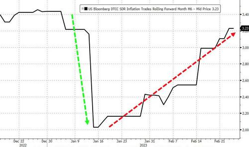
A week of hotter than expected data (especially in stickier-than-expected inflation-related data)...
Source: Bloomberg
...has driven inflation expectations roaring back to cycle highs as the 'Fed Pivot' narrative collapses...
Source: Bloomberg
A week of hotter than expected data (especially in stickier-than-expected inflation-related data)...
Source: Bloomberg
...has driven inflation expectations roaring back to cycle highs as the 'Fed Pivot' narrative collapses...
Source: Bloomberg …
Moving along … HERE are a few observations from Global Wall St inbox … a few global macro reflections on the week just passed as well as a few prognostications of what may be coming down the pike … I’m organizing and sharing this as it helps ME figure which way I believe the wind will be blowing next and as always, THESE OBSERVATIONS are to be taken with a large grain of salt … They are NOT mine and links are for those who are provisioned for them
Barclays on stuff and, “…Eggcetera” BMO on MoF data and Japanese BUYING (and having entered m/t long duration) Citi on DJIAs ‘trapdoor’ (under 32,573) DB on POSITIONS — shorts UST rose to new cycle high (matching Oct 2018) Goldilocks offers a … History of 10y JGB yields
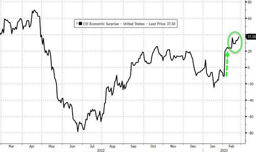
NOT included (at least not directly) on THIS LINK but a couple / few things I stumbled across on the intertubes (and yes, I believe EVERYTHING I see on the web, especially FB and TWTR — NOT) … First up, if there were only and forever TWO indicators of sorts to utilize and predict the future, well, finance and generating ALPHA would be easy, right?
(ONE of the replies caught my attention … “Do not present John Normand's work as your own.” — isn’t this how the platform works … everything is everyone’s and ZH premium is then borne? Somehow I’ll eventually get picked on as a little guy for having put forth / offered someone’s work — stating fully it’s NOT mine and giving credit … you know, where it ‘is coming due’??
Whatever the case may be — I do not know either of the random TWITS noted (not entirely true) but hey, I am the only one with an actual name whereas others feel need to hide behind these ‘stage names’ as if they are ‘next up on the main stage’ …
WHATEVER … to each his own.
For somewhat MOAR on week which just passed and readily avail on intertubes,
Markets are waking up to our expectation of more central bank rate hikes as inflation proves sticky. We go overweight U.S. short-term bonds for income.
… We increase short-term Treasuries to an overweight. The jump in yields – the two-year U.S. Treasury yield is now near 4.6% compared with 1.5% a year ago – that now means short-term bonds provide income. We also like their ability to preserve capital at higher yields in this more volatile macro and market regime. We reduce our overweight to investment grade credit. Credit spreads have tightened sharply along with stocks pushing higher, reducing their relative attraction. We remain moderately overweight and still think highly rated companies will weather a mild recession well given stronger balance sheets compared with before the pandemic. We also cut agency mortgage-backed securities to neutral due to the spread tightening.
Yardeni: Two Too Hot No-Landing Indicators Hit Markets Personal income… PCED….
UBSs Paul Donovan: Time to move to Alaska? … Not everyone is facing high food price inflation. In the US, it is best to buy groceries in Alaska—food consumed at home has barely risen in price over the past year. Falling meat prices and stable alcohol prices are behind this. Philadelphians might want to consider moving—Philadelphia’s food inflation is over 14% y/y.
The gap between the highest and lowest regional food inflation rates in the US has been over 10 percentage points almost continuously for the past eighteen months. This has never happened before—not even in the 1970s when US President Nixon’s disastrous attempt at price controls led to farmers refusing to sell food at all.
This extreme and persistent regional variation in food price inflation weakens the argument that farmers or supply chains are driving current inflation. If that were the case, Alaskans would be paying more for their burgers. This is also true in Europe where political comment around the causes of food inflation (with a focus on retailers) has increased.
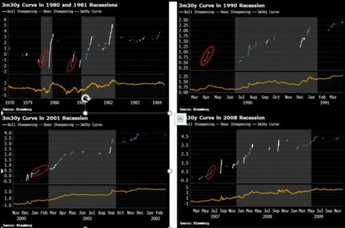
ZH: Not All Yield Curves Are Alike... But This Signal's Never Wrong
Not all yield curves are alike, and typically it is the 3m30y curve that starts to steepen first, about five months before the recession’s onset. That curve has been steepening since mid-January, its longest stint without making a new low since it peaked last May.
A few readers pointed out that as this steepening is a bear steepening, with 30-year rates rising more than 3-month rates, it may be less of a concern, and it is bull steepenings that are a more imminent sign of recession.
It is true that bull steepenings are often more violent when the Fed does a volte-face as the economy deteriorates quickly, but bear steepenings are as much a part of the pre-recession picture, and have often preceded the bull steepening in the lead up to a slump.
The charts below show the 3m30y curve around the last five (ex-2020) recessions. A bear steepening is defined as the 30y rate being higher over the last month, and the one, two, three and four-week change in the 30y rate being more than the one, two, three and four-week change in the 3m rate (and a bull steepening is defined analogously). This ensures we only capture meaningful steepenings.
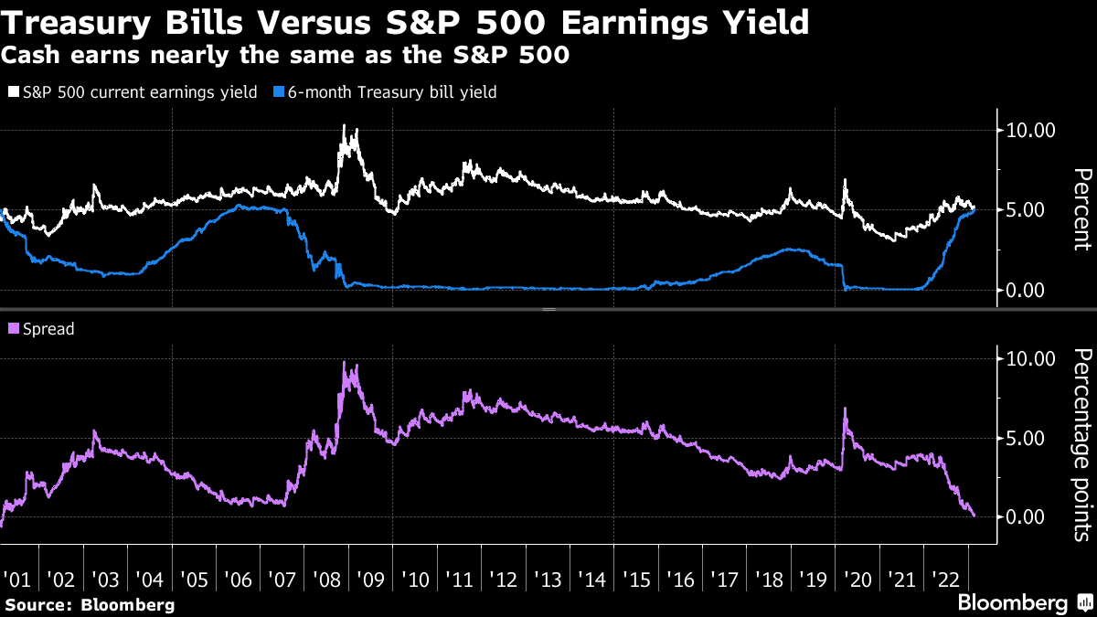
… Cashing In Treasury bills aren’t typically thought of as a route to riches, but lofty yields on cash are forcing a rethink.
Six-month Treasury bills currently yield about 5.05%, the highest since 2007. That’s just a few ticks below the S&P 500’s earnings yield of 5.2%. While not quite an apples-to-apples comparison, that’s the slimmest advantage for stocks since 2001.
If I can get reliable 5% payouts with virtually zero credit or duration risk, and without the overhang of a gloomy earnings backdrop, why bother with equities? It’s an admittedly oversimplified question, but one that money managers are increasingly asking.
“We think we’re headed into economic deterioration and the current volatility in the market is enough for us to be very cautious in equities, and you’re getting paid in the meantime to wait with cash,” said Jerry Braakman, chief investment officer of First American Trust. “So we do think it’s an attractive space to be in fixed income versus equities at this point.”
Of course, there’s more nuance than that. Cash comes with a connotation of indecision, is often seen as a waystation between allocation decisions and carries an opportunity cost. The possibility of missing out on a double-digit surge in the S&P 500 is a painful thought.
“Stock managers manage stocks, bond managers manage bonds,” said Zhiwei Ren, portfolio manager at Penn Mutual Asset Management. “For stock managers, the motivation is not to miss the rally, or underperform. That’s one big driver behind the strong rally we saw.”
Not to mention, cash comes with a unique risk at the moment as Congress hesitates on raising the debt ceiling. The Congressional Budget Office warned last week that the government could run out of cash as soon as July unless the limit is lifted.
Investors are seemingly sanguine about the situation — Thursday’s $36 billion auction of four-month bills was the first sale in nearly a month where bidders didn’t demand a concession.
McClellan Financial: There is Less Junk Than There Used To Be - Chart In Focus
… What I did was to sum the Advances plus Declines for each bond category (the unchanged numbers are very low, and thus inconsequential). That allowed me to create a daily ratio of how many of each category of bonds trades each day. Those data can be a bit noisy, and so I smoothed those daily ratio data with a 10-day simple moving average to get what you see here.
The first observation is that the ratio has been trending downward over time, meaning that there are comparatively more bonds trading that are rated as investment grade, and fewer that are in the junk category. But I wanted to find a deeper meaning, and so I compared these data first to stock prices, and then to bond prices which is what you see above. The bond comparison was much more interesting.
There is an obvious positive correlation between T-Bond prices and this ratio over time, especially over about the last 10 years or so. At times in the late 2000s (the FINRA data begin in 2005), there were inversions of the two plots, which is strange. The biggest inversion came in December 2008, in the throes of the Great Financial Crisis, as investors sought the greater assurance of a guaranteed “return of investment” in T-Bonds, and as companies were not able to issue junk debt. That was a truly exceptional time in history.
So what can we conclude from this mostly positive correlation the rest of the time? As bond prices fall, yields go up generally. So the desire of investors to reach for yield can go down incrementally, making it harder for companies to issue low grade bonds to finance their operations. That leads those companies to either find other ways of getting the capital they need, or make other arrangements such as mergers, stock issuance, etc.
WISDOMTREE: The Most Important Charts for 2023 — New on the WisdomTree Blog
By some measurements, equity risk premiums are hovering around lows not witnessed since 2008. But if you consider stocks to be real assets with inflation-hedging characteristics, then you’ll find that current equity risk premiums are actually closer to their longer-term averages. Against this backdrop, Jeremy Schwartz and Brian Manby review the most important charts for equity investors for 2023.
Moving on then TO the week ahead AND for any / all (still)interested in trying to plan your trades and trade your plans in / around FUNduhMENTALs, here are a couple economic calendars and LINKS I used when I was closer to and IN ‘the game’.
First, this from the best in the strategy biz is a LINKthru TO this calendar,
If it isn't one thing it will be another while the world works through colossal 'pilot induced oscillations' for the next four years or so. Here is a video attempting to explain the complex and difficult strategies and tactics Powell will deploy fighting inflation, and the sundry other whacky pilot induced oscillations 15 years of CB administered markets have baked in when the needle is taken away: https://www.youtube.com/watch?v=ryp5pTpxC9Y
What great artist goes out and collects ten-thousand gall beetles and renders them down over many steps and months to a dye for their textiles? or goes to the DRC and negotiates with warlords for exotic minerals for processing into pigments? etc. None of course. Your palette is the blog and information is the paint u use to express your visions ;) The Artist, however great, has little say on the impressions their public paints in their own imaginations. So, don't be like Fox 'News' which strives to spoon feed their viewers what they want to hear, cuz, that ain't News. Just keep 'painting' your authentic Truth ;), cuz, my guess is that's why you are read and your work(s) is appreciated.
Personally, I gather, collate, and evaluate ridiculous amounts of 'info' meant for no eyeballs other than mine own. It seems I lack your generosity. ... So, if it isn't to late for redemption, if The BondBeatist (or anyone foolish enough to read this on Saturday Night when they should be out Fighting) hasn't heard of them, I'll toss out a few 'info-tools' I've found 'powerful' of late. They fall under the rubric of "networked-notes." Which is best for you depends on many variables, but, most of them even have pretty well advanced iOS apps. These three can get you started: Logseq, Agenda, and Obsidian. Logseq is now useable on mobiles like iOS. Obsidian is probably still best on a 'full' OS, but it is useable on mobile. Both are free. Agenda.app is cheap and well integrated with iOS Reminders.app and Calendar.app. Such seamless-integration is kind of cool for bridging the lofty realm of learning from gathered information (i.e., wool-gathering) and "linking" the knowledge generated to actions outside the ivory towers/castles of the mind. On a mobile device yet! Following that thread there is GoodTask.app for imposing more order on the copious potential number of links any subject can spawn in a networked-notes system. Similar to GT is Things.app, but, I lean towards GT. Blah, blah, blah, ... https://www.youtube.com/watch?v=tV13y2NQtR0


Egg inflation may have finally cracked, but, the problem with cracks is they spread, [_Heavy U.S. refinery maintenance is the harbinger of tight product market_] https://www.cmegroup.com/newsletters/wti-insights-by-pvm/wti-insights-by-pvm-2023-02-24.html
If it isn't one thing it will be another while the world works through colossal 'pilot induced oscillations' for the next four years or so. Here is a video attempting to explain the complex and difficult strategies and tactics Powell will deploy fighting inflation, and the sundry other whacky pilot induced oscillations 15 years of CB administered markets have baked in when the needle is taken away: https://www.youtube.com/watch?v=ryp5pTpxC9Y
What great artist goes out and collects ten-thousand gall beetles and renders them down over many steps and months to a dye for their textiles? or goes to the DRC and negotiates with warlords for exotic minerals for processing into pigments? etc. None of course. Your palette is the blog and information is the paint u use to express your visions ;) The Artist, however great, has little say on the impressions their public paints in their own imaginations. So, don't be like Fox 'News' which strives to spoon feed their viewers what they want to hear, cuz, that ain't News. Just keep 'painting' your authentic Truth ;), cuz, my guess is that's why you are read and your work(s) is appreciated.
Personally, I gather, collate, and evaluate ridiculous amounts of 'info' meant for no eyeballs other than mine own. It seems I lack your generosity. ... So, if it isn't to late for redemption, if The BondBeatist (or anyone foolish enough to read this on Saturday Night when they should be out Fighting) hasn't heard of them, I'll toss out a few 'info-tools' I've found 'powerful' of late. They fall under the rubric of "networked-notes." Which is best for you depends on many variables, but, most of them even have pretty well advanced iOS apps. These three can get you started: Logseq, Agenda, and Obsidian. Logseq is now useable on mobiles like iOS. Obsidian is probably still best on a 'full' OS, but it is useable on mobile. Both are free. Agenda.app is cheap and well integrated with iOS Reminders.app and Calendar.app. Such seamless-integration is kind of cool for bridging the lofty realm of learning from gathered information (i.e., wool-gathering) and "linking" the knowledge generated to actions outside the ivory towers/castles of the mind. On a mobile device yet! Following that thread there is GoodTask.app for imposing more order on the copious potential number of links any subject can spawn in a networked-notes system. Similar to GT is Things.app, but, I lean towards GT. Blah, blah, blah, ... https://www.youtube.com/watch?v=tV13y2NQtR0