Just kiddin’. Never ceases to amaze me how much folks have to say and think in the hours BEFORE the FOMC meetings (and other spectacular and fun-filled market days) and how its said with such pizazz and confidence.
Only to be ruined and tossed to the wayside by days end.
Never deterred, strategists pick themselves up by boot-straps and redraw lines on graphs (guilty here) and rework narratives (notsomuch here).
Every day is a NEW opportunity and a blank slate and be that as it may, today’s note SHOULD be short and views should be kept to a minimum because I know what I don’t know.
Apparently, those forced (or interested)to bid on supply this week had some views and while yields are UP (concession), the question is IF they are UP enough relative TO funDUHmental data AND possible Fed outcomes?
ZH: Solid 5Y Auction Tails Despite Highest Direct Award Since 2019
YESTERDAY I did note bearish setup for 5yy. Thankfully we get a reprieve from bidding on 7yy until AFTER today’s much anticipated <dovish / hawkish> — please pick one — HIKE. Here’s a look at bonds. LONG bonds….
SAME kinda setup on the DAILY and it appears that 4.00% will remain ‘line in the sand’ until further notice. As does approx 5.08% on 2yy,
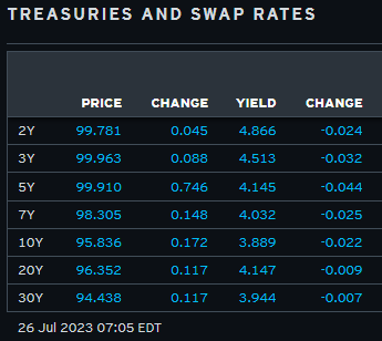
AND I’m done … here is a snapshot OF USTs as of 705a:
… HEREis what another shop says be behind the price action overnight…in a daily commentary, “Tale of Two Hikes”
… Overnight Flows Volumes were intuitively on the lighter side ahead of the FOMC with cash trading at 87% of the 10-day moving average. 5s were the most active issue with a 33% marketshare followed by 10s that claimed 22%. The front end accounted for a bit more elevated 33% with 2s and 3s taking 13% and 20%, respectively. 7s were especially quiet with just a 6%, 20s garnered 2% and 30s were muted with just 3%.
… and for some MORE of the news you can use » IGMs Press Picks for today (26 July) to help weed thru the noise (some of which can be found over here at Finviz).
From some of the news to some of THE VIEWS you might be able to use… here’s what Global Wall St is sayin’ …
I’ll begin with a few encouraging words from Paul Donovan,
Today is hopefully the final rate hike from the Federal Reserve this cycle. Looking back, there are three ways the Fed messed up since 2021. First, Fed policy spin has been terrible. The Fed was right about transitory inflation in 2021 (it was transitory), but when inflation shifted to the wartime energy shock, the Fed failed to communicate the changes properly and its reputation suffered.
Second, the June 2022 policy errors elevated the importance of consumer price data (emphasizing fictional prices), tore up years of trust in forward guidance, and did so on the basis of a data point that was revised within days.
Third, the profit-led inflation wave was evident by October 2022 but the Fed was late in communicating—popular outrage only emerged in May 2023. Fed Chair Powell could have used the platform to accelerate resistance. Unfortunately, Powell has tended to treat post-pandemic inflation as a homogenous concept, not three distinct problems (requiring three different solutions).
The US economy does look like it is heading for a soft landing, but for lower-income US households that landing is likely to be harder than it needs to be because of Fed policy. Unnecessary volatility and uncertainty about policy also carry a broader economic cost.
Regarding that SOFT LANDING and hope for the last (dovish?) hike,
… Markets put in another resilient performance over the last 24 hours, as all eyes turn to the Fed’s latest decision today. The positive mood was supported by another strong round of US data, which included the Conference Board’s consumer confidence index hitting a 2-year high. That offered a fresh boost to risk assets, with the S&P 500 (+0.28%) rising to its highest level in 15 months yesterday, Brent Crude oil prices closing above $83/bbl for the first time since April, and US HY credit spreads reaching their tightest level in 15 months too. In addition, there was a significant milestone for the Dow Jones (+0.08%), which recorded a 12th consecutive gain for the first time since 2017. If we get a 13th today that would be the longest run since 1987, so one to watch out for …
… When it comes to market pricing, fed funds futures are currently pricing just a 44% chance of a second hike after today’s. In other words, the central expectation is that this will be the last hike of the current cycle. But it’s worth remembering that we’ve been here before. In fact, after the two most recent hikes in March and May, market pricing by the close that day was that the Fed were most likely done hiking. So they’ve shown themselves willing to adjust in recent months, particularly as the ramifications from the regional bank crisis weren’t as bad as many feared at the time.
Ahead of the Fed, there was a fresh selloff for sovereign bonds thanks to another round of resilient data. Firstly, we had the Conference Board’s latest consumer confidence reading, which hit a 2-year high of 117.0 (vs. 112.0 expected). Second, housing inflation was more resilient than expected in May, with the S&P CoreLogic Case-Shiller index up by +0.99% over the month (vs. +0.70% expected). In fact, that’s the fastest monthly house price growth in a year, which is adding to the signs that housing inflation has now bottomed out and if anything is accelerating again …
Putting aside which ever sort of landing you may / may NOT ascribe to, same firm offers some TRADING tactics for the day ahead,
DB: Trading a Fed that won't know they have summited even when they have
One of the few certainties of mountaineering is that barring acute altitude sickness, you recognize the top when you are there, whereas Central Bankers run the risk of standing at peak rates for a good few months before realizing they have indeed summited!
This is relevant now because, in our view, there is almost no chance that even IF July's 25bps is the last hike in this cycle, that Powell will be 'high fiving' and giving out celebratory hugs.
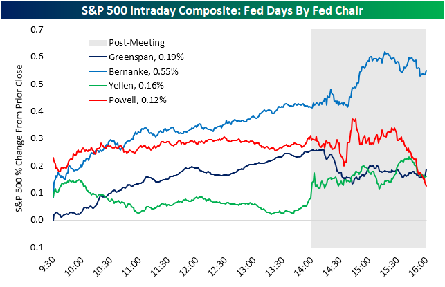
Perhaps you’d prefer a bit of a historic look back at ONLY S&P500 but broken down by Fed chairs?
Bespoke: Check Out These Charts
Tomorrow is yet another Powell Fed Day, and markets are currently pricing another 25 basis point rate hike as a near certainty. Below is an interesting chart we sent subscribers earlier showing the average performance of the S&P on Fed Days by Fed Chair since 1994 (when they began announcing policy decisions on the same day as their meetings). Historically, Ben Bernanke saw the best performance with the S&P averaging a gain of 0.55% on Fed Days when he was Fed Chair. So far, Chair Powell has seen the weakest market performance on Fed Days with the S&P averaging a gain of 0.12%. The late-day selloff is really what has characterized Powell Fed Days so far as you can see in the red line below. Time will tell if we see a similar move tomorrow afternoon.
Back TO the Fed and HOPE, which springs eternally, this day marks the LAST hike of the cycle. IF that is the case, WHAT NEXT? Cycle forward 127 days, of course,
How long will the Fed maintain a peak FFR after it has hiked rates for the last time, possibly as soon as tomorrow? We believe this is a crucial question investors will ask throughout the rest of this year. Our chart today shows that the current market expectation for the length of time between reaching peak FFR and the first 25bp cut is 127 days (from November to March).This is below the average of 160 days seen during this hiking cycle and the range of 155 to 446 days in the past four interest rate cycles.
Is the current market pricing optimal? On the one hand, this length of time would give the Fed four to five monthly (depending on the calendar) data points on inflation and the labor market, a reasonable amount of information to make the next policy move if the data trends in the right direction. On the other hand, four months seem hardly sufficient time for this cycle’s policy changes to fully work themselves into the economy given a conventional 18-month transmission lag, so the incoming data may not be convincing enough for the Fed to shift to an easier policy stance yet. With the buildup of evidence supporting a soft landing, the Fed may also feel emboldened to sit atop the peak fed funds rate for longer to ensure its work on inflation is truly finished. Our economists are sticking to a call of the final hike in July and the first rate cut in March, which implies a length of peak FFR of about 8 months. If current market pricing of the Fed on-hold period is indeed too short, fading near-term cut pricing via money market steepeners could be the right trade.
From hikes to CUTS in … 127 days? Heavens to mergatroid, what is one to DO? THAT, my friends, is easy. BUY STOCKS always and forever, despite / because all / any of the facts, right? What is that you say? You are already long? HOW long? As long as our next note / narrative from Global Wall Street fan fav?
… Uncomfortably long. Our simple conclusion is that the data are likely to continue to support both a deepening and perhaps a broadening of the market shift towards lower inflation and recession risks. With these themes more recognized, more positioned for and more priced than before, trends may be shallower and bumpier. We think this week’s Fed, ECB and BoJ meetings will probably not rock the broader narrative, though the risks lie in that direction. But we still think a pro-risk/pro-carry view still makes sense, uncomfortable though it feels. Within that, the question is how much to lean into some of the lagging cyclical areas. The US continues to provide the clearest macro narrative, but we do think there is a case at the margin for including some cyclical FX crosses and European equity upside despite ongoing weakness in non-US data. As financial conditions ease, we continue to like pairing these views with long US inflation positions and a short bias on front-end rates, at least for the US, UK and Canada. Inflation looks most under-priced at the front end of the rate curve, but as inflation comes down, we may discover that the Fed and other central banks are less willing to risk recession to bring inflation decisively below the 2.5-3% level.That could be risk-supportive too but could also see more pressure for steeper nominal and inflation curves.The longer the economy continues to avoid recession with policy rates above 5%, the more the risk grows that the market starts to raise its view of ‘neutral’ rates too. The belly of the US real rate curve looks most vulnerable to that kind of shift. On our outlook, these shifts in longer-dated inflation and real rate views seem more likely in 2024 than in 2023, but progress towards a ‘soft landing’ might bring them into focus sooner.
It all sounds so silky smooth and when you read it put THAT way, well, doesn’t feel all too uncomfortable, does it? What could POSSIBLY go wrong?
The Federal Reserve and the European Central Bank (ECB) are set to hike rates again this week, yet markets have been taking this in stride. Soft June U.S. core inflation has revived hopes for rate cuts in 2024. This can fuel a bull run across assets for some time – until it runs into the disconnect between fast-falling inflation and stronger-than-expected economic activity. We look for opportunities beyond broad asset classes, such as the artificial intelligence theme in equities.
… We expect a squeeze on corporate margins if inflation stays high – and an even larger squeeze if it falls. Tight labor markets are set to keep production costs high. A sustained fall in inflation could soften demand. Why? This would likely come from good prices falling further and/or labor markets weakening significantly. So good economic news like falling inflation is not necessarily good news for markets. Margins have already dropped, Refinitiv data show, suggesting companies are starting to have trouble passing higher costs to consumers. We are watching Q2 earnings for more signs of margin pressures.
… Bottom line: Soft inflation data has rekindled hopes for rate cuts in 2024, even as central banks are set to hike more in the near term and hold tight for long thereafter. We use our new playbook to look beyond broad asset classes in this tricky macro environment. We tap into the AI mega force within DM stocks. Mega cap tech led earnings forecast upgrades due to AI euphoria, and we’ll assess their Q2 earnings for ongoing strength. We upgrade UK equities to neutral as they better price in the weak growth outlook. We like Japanese stocks as loose policy looks set to support earnings. We favor U.S. inflation-linked bonds as markets underestimate inflation’s persistence. Yet we prefer euro area nominal government bonds over the U.S. as they price in rates staying higher for longer.
… Granular views Six- to 12-month tactical views on selected assets vs. broad global asset classes by level of conviction, July 2023
US EQUTIES: We are underweight the broad market – still our largest portfolio allocation. We don’t think earnings expectations reflect the macro damage we expect. We recognize momentum is strong near term.
SHORT USTs: We are overweight. We prefer short-term government bonds for income as interest rates stay higher for longer.
LONG USTs: We are underweight. We see long-term yields moving up further as investors demand greater term premium.
US TIPS: We are overweight and prefer the U.S. over the euro area. We see market pricing underestimating sticky inflation.
AND one from the intertubes — suggesting maybe we’ve been lookin’ for recession in all the wrong places,
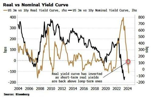
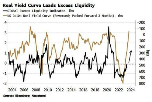
Bloomberg (via ZH): Have We Been Looking At The Wrong Yield Curve? Authored by Simon White, Bloomberg macro strategist,
The nominal yield curve is the predominant focus of attention, but in an inflationary environment the real yield curve is key to understanding the market and the current rally in risk assets.
There was a time in the not-too-distant past when using the yield curve as a leading economic indicator was fairly niche. Sure, people were aware it tended to invert before recessions, yet there was nothing like the attention lavished on it nowadays.
But the nominal yield curve is a red herring. Not only is an inversion neither a necessary nor a sufficient condition for a recession, the obsessive focus on it has obscured what has been of ultimate importance for investors in recent months: the positive backdrop for markets.
Further, the nominal curve inverted over a year ago, but the opportunity cost of using that as a signal to reduce equity exposure has been high. On top of that, even though the curve remains deeply inverted, this gives us little visibility on exactly when the next recession will hit, how deep it will be and, most importantly, what happens to risk assets.
In an elevated-inflation environment the nominal curve is inadequate, and it’s the real yield curve that has the greater utility.
It has only just inverted after flattening sharply, telling us that short-term real yields are back to being more restrictive than their longer-term counterparts. This gives us valuable insight into liquidity conditions and therefore the environment for stocks and other assets.
As an investor, the liquidity you should pay most attention to is excess liquidity (the difference between real money growth and economic growth).
Central-bank liquidity does not capture the full picture. Firstly, commercial banks - not just central banks - create liquidity when they issue loans. But even more importantly, standard measures make no allowance for how liquidity actually flows. The economy and inflation soak it up, and any portion left over, i.e. the “excess”, is available to support risk assets. Central-bank liquidity does not make these distinctions and thus gives no consistently reliable leading information about the market.
Which is why the real yield curve is important, as we find that its inverse leads excess liquidity. The chart below shows a flattening real yield curve typically precedes rises in excess liquidity, and vice-versa, by about 3-6 months.
This is a fascinating relationship, and counter-intuitive at first, as it seems to suggest liquidity increases as its price rises.
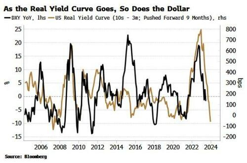
But it becomes clearer when we consider the role of the dollar. One of the best guides to the ups and downs of the US currency is the real yield curve. The dollar is driven at the margin by the real return of foreign buyers of US yields.The flattening of the real yield curve last year presaged lower demand for dollars and foreshadowed its current downtrend.
A falling dollar has been one of the biggest drivers of rising excess liquidity this year. The excess-liquidity indicator is global and dollar denominated, so a decline in the US currency drives it higher as non-US currencies strengthen. Latterly its rise has been turbocharged by falling inflation, “freeing up” even more liquidity to support risk assets.
When the real yield curve began to flatten in October last year, it was a harbinger that market conditions underpinned by excess liquidity were soon about to change, and provide a powerful tailwind for risk assets that’s still in play today. The nominal yield curve only told us that recession risk was rising, which was of little practical help to investors.
In an inflationary environment, the nominal curve has become a “stopped watch”. Not only has it been unhelpful in timing the next recession, it has given us no information on the interplay with inflation, global currencies, true liquidity conditions and therefore the outlook for risk assets.
Moreover, the next recession is likely to be of an inflationary nature; therefore we should not expect stocks in nominal terms to sell off as much as would normally be expected, further inhibiting the usefulness of the nominal curve for investors.
No relationship is perfect (if it was, I’d keep it to myself!), and rarely are effects mono-causal. There are other influences at work in the pass-through between the real yield curve, the dollar and excess liquidity. But the real yield curve offers a more complete framework for understanding the underlying market dynamics.
Most importantly, it is better poised than the nominal yield curve to highlight when probably the single biggest endogenous risk for markets is about to become a problem: a resurgence in inflation. Falling inflation is currently driving the flattening in the real yield curve and, along with the weaker dollar, the rise in excess liquidity. A re-acceleration in price growth would despoil the sweet spot risk assets currently enjoy.
Inflation in the US should not give any nasty upside surprises in the next few months, but building stimulus in China and the steady rise in oil are likely to tilt the risks at some point.
Thus, to better provide an early warning the stock rally is at risk, tracking the real yield curve will prove more fruitful than its limelight-stealing cousin.
AND for our inner stock jockeys — some of whom were reading recent mea culpas (YEST),
Cross-Asset Strategy: The equity rally over the past 2 months implies macroeconomic scenarios that are even more positive than a soft landing. We maintain that this market action is largely a result of mechanical re-risking, due to the decline in volatility and emergence of the AI-themed megacap rally. For instance, the level and increase of stock concentration in S&P 500 now is at 60-year highs (see here). This could be indicative of a bubble, and other anecdotal evidences point to an AI-driven bubble as well. While we think AI has been and will continue to be a transformative technology (and we have followed and applied it in our research for over a decade, e.g. see here or here), the current hype was triggered by popularization of chatbots that often fail in basic questions and occasionally fabricate wrong answers to more complex questions. We remain of the view that the delayed impact of the global interest rate shock (real estate, consumer credit, quantitative tightening and liquidity, etc.), steady erosion of consumer savings and post COVID pent up demand, and deeply troubling global geopolitical context will result in market declines and re-emergence of market volatility. We acknowledge that we cannot time this inflection near term, but there are no data points that would prompt us to change our methodology or conclusions. We retain a bullish medium-term duration view in the US and Euro area, enter tactical long 5Y Germany going into the ECB, and hold 10s/30s UST steepeners and Euribor curve flatteners as a bullish proxy. Slowing growth and disinflation create space for EM central banks to deliver rate cuts in 2H23, keeping us OW EM local duration. We see US HG spreads as fully valued here following their recent steady tightening trend. It feels like a good entry point for a catch-up in commodities vs. equities – amidst a broad-based rally in risky assets, commodities price in by far the highest risk of recession and stand out as under-valued, underowned, and backed by compelling fundamentals and technicals…
For ever BEAR (and seller) there IS the other side of the trade,
Positioning has increased, as more investors get drawn into the disinflation trade. But macro risks mean safety of bonds/cash and Tech/Quality/Growth stays in demand. Europe is for sale and despite improved breadth, Value-cyclicals/small caps/leveraged plays are under-owned. So further broadening of the rally a pain trade.
Disinflation prompts more investors to buy equities. The melt-up has extended into summer, with equities seeing inflows for a second consecutive month in July, the first time since March '22. As more bears are reluctantly turning into bulls on the disinflation narrative, equity positioning looks more aligned with sentiment now. Overall, positioning is starting to look more neutral to us, suggesting the strong tailwind from UW/bearish positioning being unwound is likely to dissipate from here. Systematic exposure is above-average and retail buying has picked up materially. So in fact, the risk of a position unwind is higher now in case of a vol event and we note late summer seasonality is typically negative for stocks. However, as US recession keeps being delayed and inflation moderates, we still see room for equity positioning to nudge higher, as re-risking has been prudent so far: mutual fund cash levels are high vs. history and hedge funds look to be under-invested in equities.
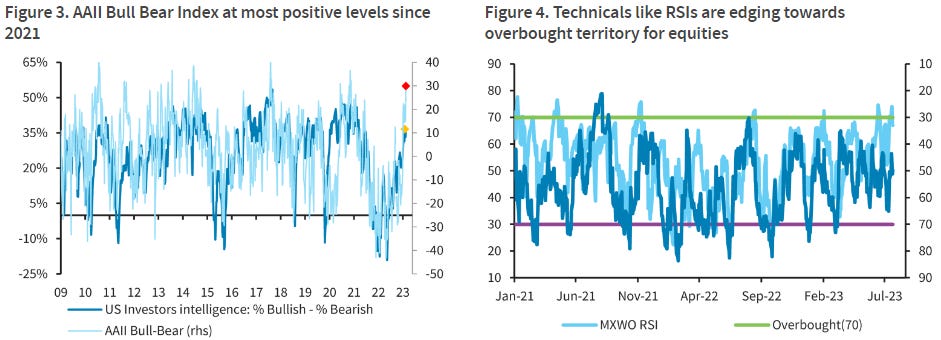
… While systematic investors turned risk-on initially earlier in the year, more investor categories like retail and mutual funds, triggered by FOMO, have been shifting steadily towards the bullish camp in recent weeks. Consequently, sentiment surveys like AAII Bull Bear Index are now looking stretched, while market technicals like RSIs are also starting to hover near the overbought territory.
… The SMART money flows index is also at the ytd highs again, suggesting that more bears have capitulated recently.
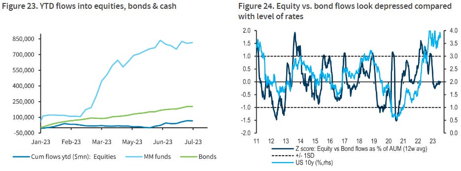
…Cash and bonds remain king amid persistent macro risks
Still, the bigger picture remains one of safety and defensiveness as ytd flows are skewed towards cash and bonds. Indeed, asset allocators look inclined to stay in bonds given the current level of yields and the potentially higher-for-longer narrative.
… The continued tightening of financial cycle conditions with lower inflation and poor economic performance will mean that long dated U.S. Treasury yields will continue to trend lower.
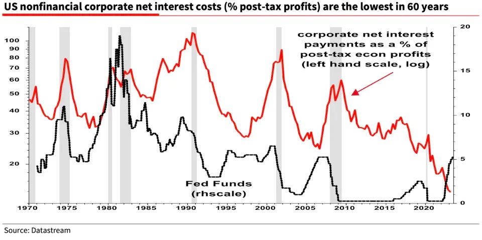
And this morning I’ll end with some views and a chart from another of one of Global Wall Streets more storied stratEgerists … Albert Edwards from late last week,
Yahoo: America has avoided a recession. But don’t thank the Fed—thank the corporate sector, says top strategist
… Wall Street economists and billionaire investors repeatedly warned over the past year that the Federal Reserve’s rapid interest rate hikes have made avoiding an economic downturn nearly impossible. But that downturn has yet to arrive, and now, Edwards has spotted another economic oddity that is helping many U.S. corporations avoid the worst of the Fed’s wrath and stave off a recession—at least for now.
“It’s not just ‘Greedflation’ that has boosted U.S. profit margins and delayed the recession,” the strategist wrote in a Friday note. “Interest rates simply aren’t working as they once did...It is indeed a mad, mad world.”
Edwards explained that, historically, when interest rates rise, interest payments on corporate debt rise with them. But over the past year, despite interest rates steadily increasing, net interest payments have fallen. “What on earth is going on?” he asked. “Something very strange has happened…”
Edwards pointed to what he called the “maddest macro chart” he’s seen in years as evidence of the broken relationship between interest rates and corporate interest payments. It shows that corporation’s net interest payments have fallen 25% year-over-year, despite a sharp rise in the fed funds rate.
Edwards went on to explain that during the pandemic, when the Federal Reserve cut interest rates to near zero to boost the economy, corporations were able to refinance much of their debt, locking in low rates for the long term. This enabled corporate net interest payments to fall, even while the Fed was hiking rates…
MADness indeed … THAT is all for now. Off to the day job…