May the force be with you as you plan your NFP trades and TRADE your NFP plans.
There’s really not much to add ahead of this mornings NFP print although, based on my previous experience, the direction of the miss of yesterday’s ADP Employment Data did catch my attention. ZH snark,
… But this report is also likely to usher in an updated version of some of the most convoluted market analysis that investors accept as normal — is "good news bad news" is "bad news good news" or is "good news good news"?
And although this framework sounds, in many ways, too clever by half, asking if "good news is bad news" is just another way to get at the question posed to investors by all jobs reports: What does this data mean for the Fed?
"Good news" in the case of the May jobs report would be another month of job gains rising more than expected by economists, wage growth remaining robust, and the unemployment rate falling further.
Data from Bloomberg show economists expect there were 323,000 jobs created last month with the unemployment rate expected to fall to 3.5%.
So there's your bogey on a report that counts as "good" or not…
IF you’d like to trust but verify all this talking head’iness, perhaps some research from a rather large German bank might help understand why the cold water (and not Kool Aid) was poured.
When we introduced our underlying inflation dashboard last year, we emphasized that it was an important tool for identifying how persistent the ongoing inflation shock was becoming (see Transient or persistent? A trend inflation dashboard for decoding monthly data). Updating our suite of statistical models for the latest PCE inflation data for April, we find that while recent headline and core price data showed some signs of deceleration, our underlying inflation measure stayed near 3%, well above the Fed’s 2% target. The latest readings are record highs for our measure dating back to the early 1990s.
Looking ahead, Chair Powell indicated that the Fed would like to see “clear and convincing evidence” of inflation cooling before slowing the pace of hikes. As such, the evolution of underlying inflation measures will likely be an important determinant of the Fed’s policy trajectory beyond the next two meetings. Our baseline remains that after delivering 50bp rate hikes at the June and July meetings, the Fed will then undertake 25bp increases until the fed funds rate peaks above 3.5% by the middle of next year (see US outlook: This time is not different for Fed tightening fallout).
AND … here is a snapshot OF USTs as of 720a:
… HEREis what this shop says be behind the price action overnight, you know,
WHILE YOU SLEPT Treasuries are modestly lower and the curve modestly flatter after another quiet overnight session (UK still out, China out) ahead of today's tier#1 data. DXY is little changed while front WTI futures are modestly (for them) lower at -0.75%. Asian stocks were mixed/higher (Nikkei +1.27%), EU share markets are all close to yesterday's closes while ES futures are showing -0.5% here at 7am. Our overnight flow color was unavailable this morning and there were three, mis-weighted (5k->5k contracts) FV-TY block flatterers(?) posted overnight. Overnight Treasury volume was ~40% of average all across the curve (30yrs just 1/4 of their average volume).
… for some MORE of the news you can use check out Finviz as well as Harkster.com
A few things I am going to be reading through as we head into the holiday shortened weeks end,
BBGs Weekly Fix notes trading govies is hard and become harder,
…An $8.9 Trillion Experiment … Given that this is the second time in modern history that the Fed has embarked on quantitative tightening, there are several enormous question marks. A big one is what the runoff will mean for the economy and fighting inflation (Fed Governor Christopher Waller: it’s “ highly uncertain”).
Perhaps a harder question to answer is what shrinking the balance sheet will mean for already-fraught trading conditions in Treasuries. Liquidity in the $22 trillion market has deteriorated over the past few months, with the Bloomberg US Government Securities Liquidity Index -- a gauge of deviations in yields from a fair-value model -- hovering near the highest levels since March 2020.
Fed officials are seemingly well-aware of the risk as the portfolio shrinks. The minutes from May’s meeting showed that several policy makers “noted that the tightening of monetary policy could interact with vulnerabilities related to the liquidity of markets for Treasury securities.”
Layer in the fact that capital requirements have kept the big US banks from adding to market-making capacity in Treasuries over the past few years, and the outlook appears dicey.
“Liquidity isn’t great and financial conditions are already tightening before dealers even need to intermediate these Treasuries and mortgage-backed securities,” said Deutsche Bank AG strategist Tim Wessel….
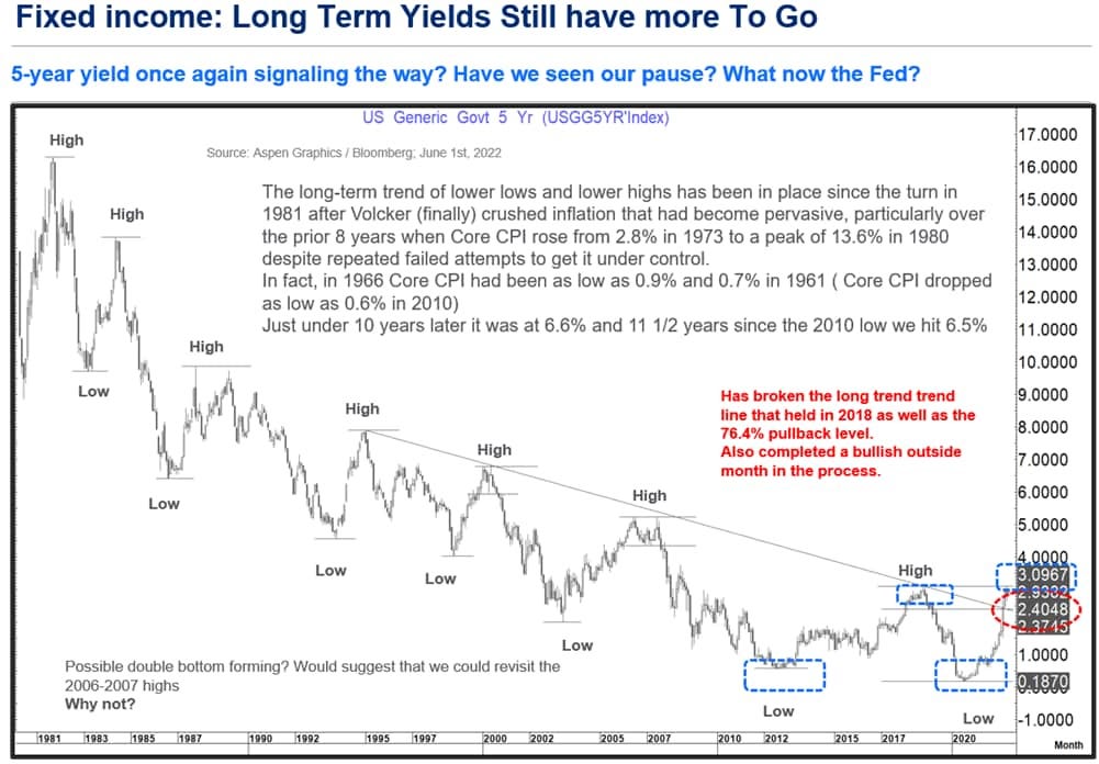
Govy trading is hard and so, speaking of govies, here’s a longer-term chart of 5yy via CitiFX
This was the trend high posted in November 2018 which held the multi-decade trend line while posting a downside monthly reversal .
It has also been the high so far in this trend posted on 9 May, off which, it posted a downside daily and weekly reversal leading to a fall to 2.66% off which it has bounced sharply in just the last 3 trading days.
However, there are a few things that are “different this time” to 2018.
The long-term trend line that contained the cyclical bear market rallies of the last ¼ century gave way in April this year with an impulsive monthly reversal to the topside as a continuation (that was also the 76.4% pullback area of the last fall in yields from 2018-2020.
As we hit that level in November 2018 Core CPI stood at 2.2% as did headline CPI giving us a yield that was 90 bp’s above inflation. Now Core CPI stands at 6.2% and headline inflation is at 8.3% with the 5-year yield at 2.91%
In fact, if we look back at all the cyclical highs in the 5-year yield back to 1981 compared to Core CPI at the time we get
As we approached that trend line as well as during the subsequent move higher this year our “financial bible” (2’s 5’s curve) never came close to inverting and presently stands at +27 bp’s.
For us, IF and only IF we see that curve invert into a minus 15 to minus 25 basis point range (As it did in 1989, 2000, 2006 and 2019) will we start to think the R word (Recession), or the S word (Stagflation) might overtake in relevance the I word (Inflation)
What are some of the drivers to look at in this potential move higher again in yields?
To begin we have the unemployment data tomorrow. Given the very low ADP print today (+128k) I would suspect the market is very susceptible to a number that even meets the 300k expectation. AHE and the participation rate also need to be watched closely…
Watching 5yy vs 3.10% and 2s5s and now I don’t have to have a look see at longer-term charts over the weekend as the best in the biz have already done so! Whether or not 5yy continue to grind higher and at what point they become a ‘BUY’ is clearly NOT today’s NFP business.
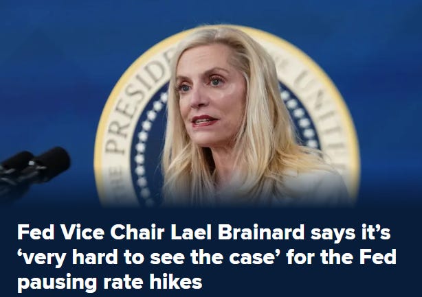
Since I began this mornings update with some thoughts from the Fed (and BRAINard), a couple more links / things to consider.
No doubt about it, mortgage rates are up. The FRED graph above shows the rates for the most popular fixed-rate mortgages: the 15-year and 30-year. Every data point is the average rate offered at that point in time for new mortgages. Although the graph shows the recent data, at this point very few people are actually paying these increased rates.
One could say that current mortgage holders are enjoying a good deal: They’re paying a lower rate, and inflation is higher. Inflation matters because mortgage debt is nominal. So, if inflation increases all prices (and in particular wages), paying a nominal debt such as a mortgage becomes much easier. One might then consider that even new mortgages are also a good deal when there’s inflation.
The previous low-rate mortgages were not set during a time of higher inflation, and those who set the rates must not have anticipated the higher inflation to come. But the new mortgage rates now include the anticipation of higher inflation, and thus this inflation advantage is factored into the mortgage rate.
To look at the data behind this argument, we use the FRED graph below. Here, we deflate each mortgage rate by the corresponding “breakeven” rate, which takes into account the anticipated average inflation from the point of measure over the relevant number of years. (Unfortunately, there’s no 15-year breakeven rate, so we average the 10- and 20-year rates using FRED’s fancy tools.)
The result is actually not that different. The real mortgage rates are still significantly up. The reason is that inflation expectations over such long horizons (15 to 30 years) have not moved that much, likely reflecting a general expectation that inflation won’t last. Our last FRED graph documents those expectations.
Nothing without a consequence … ?
In closing and addition TO Biden’s WSJ OpED from the other day, FRBSF has released 60sec video in case you were wondering,