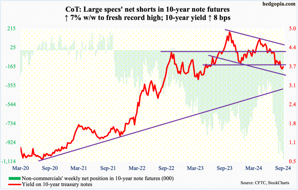
Good morning … Markets are aggressively UNCH despite / because of PMI data overnight (EZ private sector BACK in contraction on factory slump) and the PBoC (stimmy HOPES rise as PBoC cuts rates, presser tomorrow) … And so, with a big week ahead in as far as Fedspeak goes and while we learned Friday of WHY Bowman dissented (noted over weekend) and also got a run through of positions (large specs net short a fresh record high… ALSO noted over the weekend), I’ll jump in with a look at 10s …
10yy WEEKLY … are we heading back UP to 4.00 or down TO 3.30?
NOTE: momentum now a more bearish input and so time at a price OR yields going higher can / will resolve … POSITIONS are record net short and speculators may be short 10s as part of a steepening trade (working, finally) but if / when they decide to ‘put some hay in that barn, well, COULD provide some rocket fuel for move LOWER …
With this in mind and ($183bb coupon) supply in the week just ahead … I’ll move right along and so … here is a snapshot OF USTs as of 657a:
… and for some MORE of the news you might be able to use…
NEWSQUAWK: USD and fixed bolstered by PMIs, US data & Fed speak ahead … USTs remain steady ahead of its own PMI release, Bunds were lifted after poor EZ PMIs & Gilts gained after UK PMIs missed across the board, but still point towards a “soft landing” for the UK economy .. USTs are little changed overall but toward 114-26+ highs given the bullish-bias from the morning’s European data points (discussed below). US PMIs are on the docket today, with a few Fed speakers dotted across the day, including Bostic, Goolsbee and Kashkari.
Finviz (for everything else I might have overlooked …)
Moving from some of the news to some of THE VIEWS you might be able to use… here’s SOME of what Global Wall St is sayin’ (in addition TO what little was noted over the weekend …
Here’s a note / thoughts on rate hikes / cuts and impacting ON economy and another from same shop on using data science to tell (economic)stories …
Following FED rate cuts it can take a few quarters for activity data to feel the benefit. Historically, no recession = flat ISM for 9 months while recession = down 10-15% over next 3-6 months. VWS, LIGHT, ALO typically outperform on 6 month view.
BARCAP: A data science approach to economic storytelling: That '80s Show
Is a soft landing possible for the US economy? Yes, if outcomes are similar to 1986, which our model identifies as a period of similar economic conditions to today. If history repeats, or even rhymes, then a recession could be several years away, though policymakers could have a hard time staging a re-run.
… For measuring similarity between periods, we calculate the Cosine distances of the August economic data to each month since January 1950, and take the months with minimum distances as our closest historical analogies. The features we use in the distance calculations are derived from headline CPI, unemployment, the federal funds rate, GDP, and the S&P 500.1 Features include absolute levels for most variables,2 but also the trend in the economic variables in the three, six and 12 months leading up to each time point.3 Figure 3 plots our economic distance measure, scaled to 100, at the most dissimilar time point (May 2021).
Here’s a note dropped yesterday (Sunday) morning in effort to help you do as we all wanna do and stay ahead of the curve (and win business // flow … a shop I used to trade regularly with and have nothing but great things to say for them all…)
A ‘risk management’ cut of 50bp from the Fed is supportive of further USD weakness, in our view. Markets will remain asymmetrically sensitive to data weakness from the US, we think, with limited tolerance from the Fed for further cooling of the labour market. We have added a long EURUSD spot position, targeting 1.16.
FX supply from Asian and Chinese exporters could add more impetus for continued USD weakness: SAFE August data have already shown initial signs of this flow. The approaching US elections, however, are the main risk to our weaker USD view.
Not all central banks will follow the Fed with larger cuts. We like paying the RBA December versus receiving November FOMC. We also remain long BRL and hold flatteners in the DI curve after the BCB re-embarked on a rate hike cycle last week.
Missed this until late yesterday afternoon, AFTER them NYG actually won a game (thanks, Cleveland…) and it would appear that not EVERYONE remains on Team Bull Steepener …
The broad curve hit its steepest levels since early-2022 after the Fed delivered a larger 50bp cut, though the latest move has been in more bearish fashion than the bullish steepening that has defined the last 3 months...
...though the delivered ease was dovish, the SEP and the Chair’s comments were more balanced, and would not necessarily support a steeper curve...
...and this “appropriate recalibration” is being driven by risk management concerns, front-loading easing, so as to not bring the current expansion to a premature end
Should this action support better growth outcomes in the future it could steepen the curve. The reaction across a cross section of macro asset class this week indicates this burgeoning narrative could be gaining steam
If this narrative persists, we unwound our steepeners prematurely, after holding them for the last 9 months, though we recommended these positions as a more bullish duration proxy. This could make the case for steepening in either direction, and is also supported by our view that term premium should rise over time
We do not want to chase the curve given how it has decoupled from the market’s terminal Fed expectations in recent days, and given that OIS forwards have more closely converged to our Fed forecast in recent weeks. With short-duration Treasury supply to be digested next week and these trades incurring negative carry, we will be patient before adding back to steepener exposure
Intermediate valuations have begun to flag as somewhat cheap, but with money markets converging closer to our Fed forecast and yields still in the bottom 40% of their recent range, we do not feel compelled to add duration at current levels
…The Treasury curve made new steeps for the cycle, which should be of little surprise considering the Fed delivered its first ease in more than 4 years, and a bigger cut than most market participants had expected. Indeed, long-end yields rose 9bp and the 2s/30s curve steepened 6bp by a similar magnitude this week, moving back to levels last see in early-2022 (Figure 11The curvahed itsplev incarly-20.). However, this week’s steepening was in a bearish fashion rather than the bullish steepening that has defined the trend for the last three months or so. Given these moves, the yield curve now appears too steep relative to its primary driver: Figure 12.but inamore bishfaon tiswek, athcurve apstogiven thlof1y OISrates shows 1y1y OIS has explained about 85% of the variation in the slope of the curve over the last 6 months, and the curve now appears 20bp too steep on this basis.
Another note written and sent on Sunday in effort to be first INTO the inbox and so, to win business … this note specifically focuses on the big “IF” which is a soft landing (and so, how will levered loans fare …) /// also, firm ways in on how US rate cuts will impact the global AND everyone’s fav stock jockey …
…Since the beginning of the year, we have remained constructive on spread products (especially corporate credit) and securitized credit, even as valuations have tightened. Our stance is based on the notion that credit fundamentals will stay reasonably healthy even as economic growth decelerates. Further, we believe that credit fundamentals will improve with rate cuts because stress in this cycle has mainly come from higher interest expenses weighing on corporations and households, unlike recent periods of stress in credit markets (2008/09, 2015/16 and 2020). Leveraged loans, which are floating-rate instruments, provide the best illustration. As the Fed started tightening in 2022, we saw increasing pressures on interest coverage ratios for leveraged loan borrowers, leading to a notable pick-up in downgrades and defaults in loans. As rate hikes ended, we started seeing stabilization in coverage ratios, and the pace of downgrades and defaults slowed. Now, with the cutting cycle under way and the dot plot implying 150bp of cuts ahead over the rest of this year and next, the pressures on interest coverage ratios for leveraged loans are set to ease, if the economy stays in soft landing mode. This suggests that while spreads are tight, they could remain around these levels and even tighten a bit further. After all, IG corporate credit spreads were about 30bp tighter in the mid-1990s, the last time the Fed achieved a soft landing.
That 'if' looms large. If we are wrong on the soft landing, our conviction about spread products will prove to be misplaced. The challenge with any landing is that we can’t be certain of the result until it is clear. Until then, we are merely hypothesizing about the prospects, and every data point will be scrutinized for evidence of a hard or soft landing. This means that incoming data pose two-sided risks to the path for credit spreads. If they are weak – especially employment data – it's likely that faith in a soft landing will dim and spreads will widen, but if they are robust, we may see spreads tightening even further from current levels.
MS: The Weekly Worldview: As the Fed recalibrates, what does it mean in a global context?
The Fed started its easing cycle with a 50bp cut. We don't think the Fed's reaction function has changed, and so the read through for other central banks is still limited.
…For the DM central banks, the 50bps cut does not materially shift our expectations. If we are right, and Powell signaled a willingness to cut more, but ultimately our forecast of a string of 25bp cuts is realized, then there is little reason for other central banks to adjust. In Europe, we await inflation data to affirm the slowdown after softening wages provided the conviction for the September cut, and we expect the next cut in December. A stronger euro would reinforce the trend, but not change the path enough to prompt more aggressive cuts by the ECB. In the UK, after a skip in September given question marks about inflation, we see the BoE restarting their cuts in November. The split decision at the most recent meeting shows that the MPC is not making frequent adjustments to its plans based on modest changes in incoming data. Finally, we expect the BoJ to stay on hold until January. This week’s meeting was primarily about communication, and indeed, Governor Ueda’s comments did not prompt the type of reaction we saw at the July meeting.
So, the Fed did not fully recalibrate its outlook. Instead, it signaled a willingness to make large shifts, but not a clear indication that the fundamental strategy has changed. The market implications are clear, the Fed easing rates with economic growth remaining resilient is positive for risk assets. But the Fed is trying to prevent complacency. And uncertainty is plentiful, if for no other reason than that the range of possible outcomes of the US election make forecasting 2025 very difficult.
MS: Weekly Warm-up: The Market Discounts an Outsized Cut and Waits for Clarity on Labor Data
The Fed delivered on what we thought was the best short-term case for stocks. Tactically, we move to neutral on defensives vs. cyclicals as markets await more clarity on the labor data. We continue to recommend a large cap, quality bias and include relevant screens in today's report.
… As Exhibit 1 and Exhibit 2 show, current labor market conditions have softened, and improvement in this data will be an important determinant of whether we see a more sustainable rotation back toward cyclical equities.
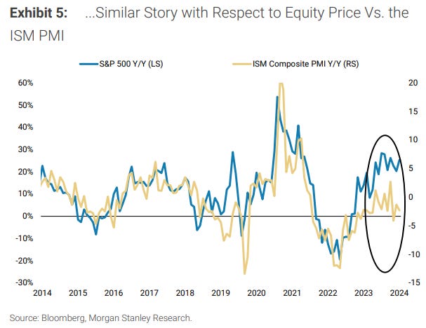
…Exhibit 5 shows that the ISM PMI has also yet to pick up and continues to diverge from price
… Finally, a couple from Dr Bond Vigilant, a look at the ‘economic week ahead’ (and visual of 2s and 30s as well as 2s, 10s, 10s and SURPRISES … with some historical context) …
This week's economic indicators should confirm our view that the Fed cut the federal funds rate (FFR) by 50bps (rather than 25bs) last week just as the economy is rebounding from its recent soft patch. Fed Governor Chris Waller's Friday comments on CNBC suggest even previously hawkish FOMC members are now onboard Chair Jerome Powell's easing train.
Meanwhile, regional manufacturing surveys (Tue & Thu) could signal the goods-producing sector is entering an upswing after its stagnation over the past three years. Consumer sentiment indicators (Tue & Fri) might have rebounded in September, which would counter concerns over the labor market and consumer balance sheets.
Stronger-than-expected economic data would be a boon for stocks. Stocks in the S&P 493 should benefit from looser monetary policy and solid economic growth. Bondholders may be less enthused, as long-term Treasury yields likely continue to rise in this recession-less scenario (chart).
So far, September isn't living up to its bad reputation for the stock market now that the S&P 500 and the DJIA are at record highs. At the start of the month, on September 2, we asked, "What Could Possibly Go Wrong?" We wrote: "We are hard pressed to find what could possibly go wrong in September. So perhaps, the path of least resistance will continue to drive stock prices higher. We are still expecting a yearend rally to 5800 on the S&P 500, but it could already be underway."
So far, the big surprise has been a positive one for the stock market: The Fed cut the federal funds rate (FFR) by 50bps rather than 25bps on September 18. On September 2, we wrote that better-than-expected economic indicators are likely to rattle bonds more than stocks. That seems to be happening. Consider the following developments:
(1) Disinversions. During the previous four periods of yield curve disinversions, the 2-year Treasury yield fell faster than the 10-year Treasury yield (chart). All four coincided with recessions. This time, there's no recession. So now investors must consider the possibility that the Fed's easing will continue to drive the 2-year yield lower, but the 10-year yield might move higher on concerns that the Fed might heat up a warm economy. That seems to have been the initial reaction to the Fed's 50bps cut in the FFR last Wednesday.
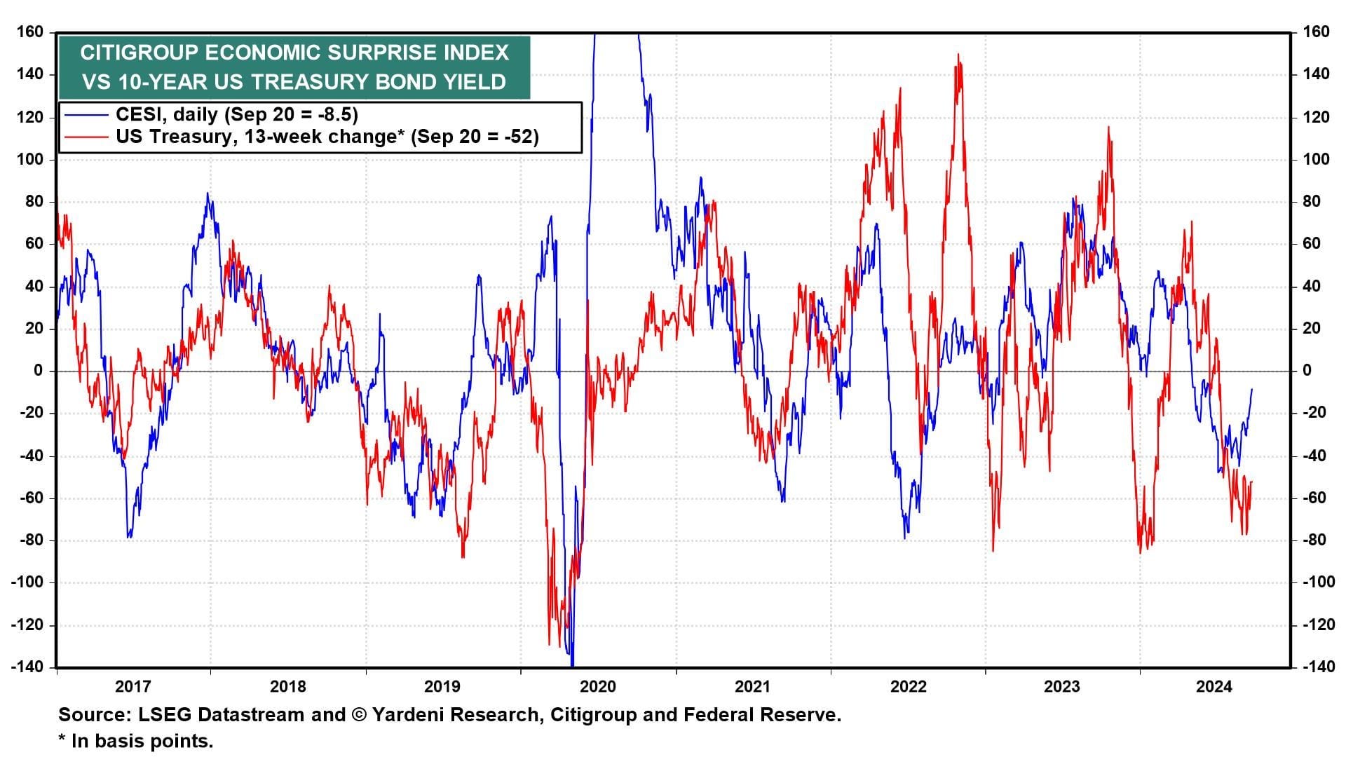
(2) Economic surprises. The 13-week change in the 10-year Treasury yield is highly correlated with the Citigroup Economic Surprise Index (CESI) (chart). The CESI hit a soft patch from May through August. It has been firming up so far in September, though it is still slightly negative. We think it could strengthen further into positive territory through October, which could send the 10-year yield back to 4.00%.
(3) Crude oil. Another correlation worth watching is the one between the price of crude oil and the bond yield (chart). If the US economy shows signs of strengthening that might lift oil prices. In addition, the Chinese government might respond to its rapidly weakening economy with a big stimulus package. The 10-year Chinese government bond yield was down to 2.05% on Friday. Reuters reported that "China could issue ultra-long-term treasury bonds within two years to generate at least 10 trillion yuan ($1.4 trillion) worth of stimulus to the economy, a former central bank adviser said on Saturday, according to state media."
… And from Global Wall Street inbox TO the WWW, where I suppose this ‘stack falls, and some resources out there for the ‘taking’ … a few things to note …
Bloomberg on the ECO Week Ahead offering up a snazzy headline …
Bloomberg: Fed’s Favored Price Gauge Seen Substantiating Rate Cut
Switzerland, Sweden seen cutting rates, Australia to hold
OECD is set to publish new economic forecasts on Wednesday
The Federal Reserve’s preferred price metric and a snapshot of consumer demand are seen corroborating both the central bank’s aggressive interest-rate cut and Chair Jerome Powell’s view that the economy remains strong.
Economists see the personal consumption expenditures price index rising just 0.1% in August for the second time in three months. The inflation gauge probably climbed 2.3% from a year earlier, the smallest annual gain since early 2021 and a shade higher than the central bank’s 2% goal.
The slowdown in inflation from a year ago reflects falling energy and weaker food prices, along with moderating core costs. The PCE price gauge excluding food and fuel probably rose 0.2% for a third month, economists expect government data to show Friday.
The step-down in inflationary pressures from earlier this year provided Fed policymakers with enough confidence to lower rates on Sept. 18 by a half percentage point. The cut was the first in more than four years, and represented a pivot in the central bank’s policy toward averting a deterioration in the job market.
… imagine if they and Global Wall are wrong with f’casts…?
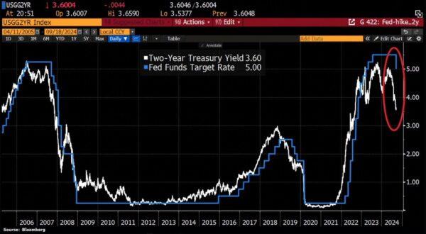
Here are a couple good charts — one familiar (2s and FedFunds and another of global bonds …)
Here’s a chart that’s been floating around a lot and I think it communicates a very common myth about how the bond market works. The chart shows the 2 year note vs the Fed Funds Rate. Now, if you looked at this chart throughout history you might be inclined to think that the 2 year leads the FFR. And in many cases it looks like the 2 year is forecasting something like a recession. For instance, in 2008 the 2 year was cratering even when the FFR remained relatively elevated. What is really going on here?
…As it pertains to the 2 year the Fed is much more influential than it might appear. I like to think of the 2 year note as the bond market’s best guess about where the FFR will average over the next 2 years. For instance, the current 2 year note yield of 3.6% is very close to the average of the current FFR (4.8%) and the Fed’s 2 year projection of the FFR (3%). So the Fed is letting the dog take the leash to where they’ve projected. In other words, it might look like the 2 year is leading the FFR, but the 2 year is just going to where the Fed has said it should go. So think of it like this – the Fed has 100% control of the FFR, 80% control of the 2 year and something like 50% control of the 30 year. The further out you go on the leash the more the Fed lets the dog wander and send signals back to the Fed, but don’t mistake this for the dog walker lacking any control and certainly don’t mistake it for the dog leading the walker. It’s not that simple.
2) Nobody Knows Nothin’ – Bond Edition
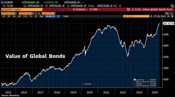
Here’s an incredible chart of the value of global bonds reaching a new all-time high. Remember back in 2022 when nearly everyone was saying 60/40 is dead because the 40% bond piece is dead? It’s amazing how these narratives repeat themselves like clockwork. When rates were at 0% investors convinced themselves that rates would never rise. Then, as soon as the Fed starts raising rates, bond prices fall and all we heard was that interest rates (and inflation) would spiral out of control higher. We were told that a 60/40 portfolio was dead at the exact moment when it was looking more attractive than ever.
Year-to-date the bond aggregate index is up 4.77% with a standard deviation of just 5.6%. Any time you’re getting a return that is close to the standard deviation you know you’re getting a pretty good risk adjusted return (and yes, we can eat risk adjusted returns as I recently noted). And the good news is that this period of strong performance is unlikely to end any time soon because the Fed is clearly beginning a rate cut cycle, inflation is showing no signs of a resurgence and the yield on something like the aggregate bond index is still a very attractive 4%. So, don’t let people scare you out of bonds these days. This is not the time to be scared about bonds…
Over the past year, there has been a steady string of layoff announcements from companies large and small.
Despite the news headlines regarding layoffs and the recent increase in the official unemployment rate, the popular economic indicator of weekly jobless claims has not staged a material rise commensurate with the other employment statistics.
The unemployment rate can rise due to workers losing employment or a lack of new job creation. Currently, the rise in unemployment is coming mostly from a lack of new job creation, which is not uncommon at the start of economic downturns.
As business conditions weaken, companies take several steps to protect profit margins, including reducing hours worked, scaling back capital expenditures, and freezing new hiring. All of these early steps are captured in a well-formed Leading Employment Index…
…Soft landing situations have occurred when there was an increase in jobless claims and then a return to a new cycle low.
Broadly, the collective basket of leading employment variables is objectively worsening, so the forward outlook on the labor market is overall pessimistic, but the future path of jobless claims will be important to monitor.
In summary, jobless claims are a sound leading indicator of the labor market. Lead times are highly variable, including zero months ahead of the 1974 recession, a recession with very delayed job losses. Jobless claims should be considered within a broader basket of leading employment variables.
MacroMornings with a chart of TBOND futures from 1977 through August (but then, extrapolating / GUESSING a move through 2028??)
👉 Macro Mornings Thoughts: If the current trajectory continues, the implications for the economy could be staggering - rising yields will tighten financial conditions, making borrowing more expensive for consumers and corporations alike.
AND …
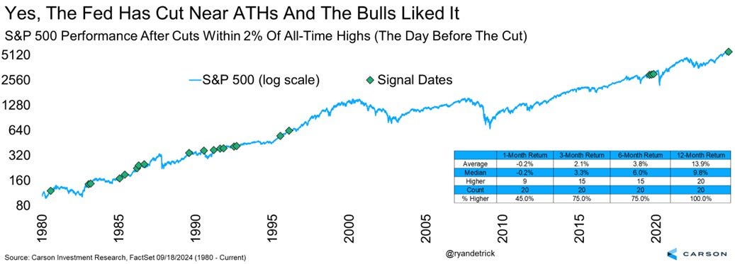
Sam Ro from TKer: 10 charts to consider with stocks at all-time highs
… One observation that many folks have been making is that the Fed’s recent rate cut is coinciding with a stock market near record highs. How can that make sense?
It actually happens to be the case that it’s not unusual for the Fed to cut rates with stocks near record highs. From Carson Group’s Ryan Detrick: “Here are the 20 times the Fed cut rates when the S&P 500 was within 2% of an [all-time high] (based on the day before the cut). Higher a yr later all 20 times and up 13.9% on avg. [Wednesday] was the 21st time.“
Here’s a more detailed look at those historical instances…
…When the yield curve disinverts As TKer subscribers know, I’m not crazy about reading too much into single metric market indicators like the yield curve. More here and here.
Here’s what Goldman Sachs recently observed about yield curve disinversions and the stock market: “On average, US equities delivered the strongest forward returns if the US economy was already in a recession at the time of the US 2s10s dis-inversion – the market usually would have already sold off at the start of the recession and rebounded not long after the yield curve dis-inverted. Unsurprisingly, equity prices tended to consolidate if the yield curve dis-inversion was followed by a recession within the following year. On the other hand, equities typically delivered positive albeit low returns if the US economy avoided a recession.”
(Source: Goldman Sachs)
Long story short, the real signal comes from whether or not the economy goes into recession, which the yield curve hasn’t been particularly helpful in predicting lately…
…Much of the stock market’s gains have come when the market is closed Bespoke Investment Group makes some of the most fascinating observations in their killer research.
In their Sept. 13 note to clients, they observed: “…this year, nearly all of the market’s gains have come from moves outside of regular trading hours. As shown, had you hypothetically bought SPY at the close every day and sold it as the next open, you’d be up 13.8% this year. Had you done the opposite and bought SPY at the open every trading day and sold it at that day’s close, you’d be up just 3.3%.“
(Source: Bespoke)
Who knows what explains this phenomenon? And who knows if it’ll continue?
All I know is I’m not crazy about trading in and out of the market at such a high frequency.
In fact, one of my favorite quotes about investing comes from Bespoke’s Paul Hickey: “A one-day holding period, it’s a coin flip. The longer you’re willing to stick to it, the better. … Markets have never been down over a 16 year stretch or longer. Time heals in the markets.”
…High and rising interest rates don't spell doom for stocks Generally speaking, rising interest rates are not welcome news for the economy and the stock market. They represent higher financing costs for businesses and consumers. All other things being equal, rising rates represent a hindrance to growth. However, the world is complicated, and this narrative comes with a lot of nuance. One big counterintuitive piece to this narrative is that historically, stocks have actually performed well during periods of rising interest rates.
The poor ISM data reignited recession fears, but the balance of data we track shows the US growth outlook is for moderate slowing, not recessionary collapse.
Our main US growth leading indicator ticked down this month with a point-estimate of 1.7% YoY, weighed down by the manufacturing and housing data, but held up by credit and services.
The Fed Weekly Economic Index shows growth is still running around 2% annualized.
The Atlanta Fed GDPNow also corroborates the 2% number. As a reminder, we strip out the volatile components from GDPNow and focus only on the private sector consumption and investment components. For added context, Bloomberg’s GDP Nowcast is at 2.1% and the NY Fed is at 2.5%.
… I report their report and YOU decide??
Finally, some words and eye candy from the wolf of wall …
WolfST: The Yield Curve Before & After the Rate Cut: Why Have Longer-Term Yields Risen since the Rate Cut? Priced in? Inflation Concerns as Policy Loosens


FED RATE CUTS. MORE PRINTING. MORE DEBT.....ZeroHedge
https://youtu.be/Ir9moe8Ce0g
"Aggressively Unchanged" sounds like Newspeak there Orwell LOL 😉