(USTs touch lower, steeper with 'challenged' volume stats) while WE slept; "Turns Out Rich People Like Bonds" -@kgreifeld; worst year for 60/40 since 2008 and more (good = bad)
Good morning … good data turned out to be bad news and we needed some HOPE on government waste and largess to help offer sticksave TO markets?
ZH: Stocks Clubbed Like A Baby Seal After Tepper Tantrum; Bounce On Big Bill
As far as the ‘good’ news being bad goes, a few words on Claims from DataTrek
Topic #1: Putting today’s US Initial Claims for Unemployment Insurance into a long-run perspective. This morning’s report showed 216,000 newly unemployed American workers filed for their first payments last week, up 2,000 from the week before. The 12-month average is 215,528/week, so in the simplest terms there is no sign the US labor market is cooling. None.
The following chart shows the number of weekly Initial Claims from 1967 to 2019. We have noted the current level of 216,000/week with a dotted line. Keep in mind that these numbers are not adjusted for the size of the US workforce, which has grown by 115 percent since the starting point of this graph. The number of Initial Claims at present is therefore remarkably low versus the last 5 decades.
The arrows and notations in the chart highlight why Initial Claims data is worth watching. They have started to increase at the beginning of every recession, just as you would expect they would. The root cause of a given recession do not matter. It could be an oil shock (1973, 1979, 1990), or a Fed-induced economic slowdown (1981, 2000), or a financial crisis (2008). Rising initial claims signal trouble ahead.
Takeaway: Initial Claims are the highest frequency data we have to both monitor the health of the US labor market and assess the current trajectory of the US economy, and this week’s readings say everything is fine on both counts. Yes, layoffs are more in the news, but the data here shows any newly jobless workers are generally finding employment elsewhere, and quickly. This is certainly not what Chair Powell or the FOMC want to see as they try to cool the US labor market.
Good data, then as BAD at least as far as Team PIVOT’istas goes? For MORE good data,
ZH: Final Q3 GDP Comes Unexpectedly Hot At 3.2%, Well Above 2.9% Estimate
… here is a snapshot OF USTs as of 703a:
… HEREis what another shop says be behind the price action overnight…
… WHILE YOU SLEPT Treasuries are modestly lower and the curve modestly steeper- following slightly less modest sell-offs in Bunds and Gilts this morning. DXY is modestly lower (-0.2%) while front WTI futures are higher (+2%). Asian stocks were mostly in the red (Korea's KOSDAQ hit the worst at -3.3%), EU and UK share markets are mixed while ES futures are showing +0.2% here at 6:50am. Our overnight US rates flows were unavailable again while overnight Treasury volume remained challenged at ~45% of average overall with 3's, 20yrs and 30yrs all showing just ~20% of average turnover this morning. "Mortimer, some eggnog please..."
… and for some MORE of the news you can use » IGMs Press Picks for today (23 DEC) to help weed thru the noise (some of which can be found over here at Finviz).
With little to add to markets that are extremely quiet heading into the holiday shortened WEEKS just ahead, I’ve little more from Global Wall Street to add (aside from THIS LINK created / updated / and passed along this past weekend).
A couple things which I’ve read and which may be of interest — in effort to keep them from staying under the radar screen — are a couple things. First, this one from DB on,
With the BoJ’s adjustment to YCC this week, a key point of interest is what impact this and other potential BoJ policy shifts will have on USD interest rate markets.
Our FX strategists argue that the biggest impact from this week's policy move is likely to be yen strength. They note that Japanese investors liquidated record amounts of foreign bonds over the past 12 months and have held the cash offshore rather than repatriating it. In USD alone they estimate nearly $100bn of cumulated balances over the past year. A key implication of this hoard of USD cash is that adjustments in bond markets to tighter BoJ policy could be muted.
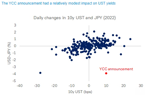
As today’s COTD shows, this is consistent with the market reaction to this week’s YCC announcement. On Tuesday, the yen appreciated 4 percent against the dollar, the biggest one-day gain in over 20 years and biggest move in either direction since 2008. In contrast, the 10y UST yield increased 10bp. While that's not a small change, the 10y has moved by more than that (up or down) on 48 trading days this year.
This suggests investors are, for now, relaxed about the impact of the policy shift on US yields. Of course this comes at the end of the year amid light holiday trading, suggesting caution against overinterpreting the initial response. And a more material move towards tighter BoJ policy next year that narrows yield differentials on a sustained basis could prompt significant sales, though FX-hedged long-term Treasury yields are already well below Japanese yields, and the empirical relationship between hedged USD-JPY spreads and flows isn't strong.
The firm continues to ask and offer scatter plots as answers,
How important is YCC tweak for US Treasuries anyway?
The common narrative after the BOJ’s surprise YCC tweak is that Japanese investors could further retreat from US Treasuries as they are more incentivized to sell foreign assets for domestic bonds. While undoubtedly a negative demand factor, we question how much impact higher JGB yields and the presumed portfolio flows would have on the Treasury market, noting that Japanese investors have already sold a record amount of USD bonds over the past 12 months. With attention also on the movement of the spread between currency-hedged Treasuries and JGBs, we look for empirical evidence of this metric has on portfolio flows but find limited support. This note follows up on our COTD yesterday suggesting a limited initial market reaction to the news.
Over past 12 months, Japanese investors liquidated foreign sovereign bonds in unison across different markets, but Treasuries took the brunt with cumulative sales of $148bn through October. Comparatively, sales of Germany, France and UK sovereign bonds were only a tiny fraction over the same period. As our FX strategist colleagues pointed out, instead of repatriating their cash, Japanese investors held USD balances offshore. It is reasonable to assume that domestic purchases of JGBs would be financed first by the repatriation of this cash rather than new sales of Treasuries.
That is not to suggest that the Japanese won’t liquidate more of their Treasuries holdings. As many observers point out, currency-hedged Treasury yields to a Japanese investor are currently deeply negative. The spread of a hedged Treasury to a JGB is even more negative. But historically, this has not deterred the Japanese from being active buyers in the market. For example, currency-hedged UST-JGB spreads were similarly negative in 2005-2008, and to a lesser degree in 2018-2020. Japan’s portfolio flows into Treasuries were positive overall in both of those periods.
As shown in the scatter plots below, the empirical relationship between hedged yield spreads of foreign sovereign bonds vs. JGBs and Japanese flows into those respective markets is quite weak. One potential explanation is that Japanese investors have different mandates and not all of them buy foreign bonds on a currency-hedged basis, therefore this metric matters little to them. Another explanation is that the conventional currency hedge assumes rolling over short-term FX forwards, which does not reflect true economic cost over the actual holding period. Investors may still find Treasuries attractive if they think that hedging costs will be lower in the future while the opportunity for capital appreciation is rife.
What drives Japan’s outward portfolio flows then? Overwhelmingly, we find it’s the change in the JPY currency that provides the most explanatory power. The correlation coefficient between quarterly flows and the percentage change in the yen is 0.50 going back to 2005. This relationship may simply come down to the fact that a stronger yen encourages Japanese investors to diversify into more foreign bonds, and a weaker yen prompts the selling of foreign holdings to either take profit or raise cash in domestic currency, depending on the need of the investor.
What does this all mean for Treasuries? For starters, the same headwinds that make Treasuries unattractive will likely carry over into next year, such as a weak yen and high hedging costs. On the other hand, if the Fed turns dovish just as the BOJ begins to step up its tightening, hedging costs should fall. Importantly, as our FX strategists argued, the most direct impact of higher JGB yields may simply be JPY strength, as Japanese investors need to repatriate offshore dollars to buy yen in order to take advantage of higher domestic yields. A resurgence of the yen could reignite portfolio flows into foreign bond markets, especially if investors see opportunity for higher overall returns once inflation gets under control. With monetary policies in the US and Japan potentially diverging next year, we see a good case for a slower pace of Japanese liquidation of Treasuries. But a caveat in all this: insofar that Japanese yields are becoming more competitive with the rest of the world, the days that Japanese investors can be reliably counted on to accumulate Treasuries are probably numbered.
John Authers of Bloomberg asks (and his conclusion / most important chart are what caught MY eyes),
… The most important point is that widespread confidence that rates would soon head down has taken a knock. One good illustration is the 10-year Treasury Inflation-Protected Securities yield, representing the market’s best guess at a real yield after inflation. This crucial measure had an upward shock for the ages over the first few months of 2022, but appeared to set a top last month. That’s now in doubt, with real yields closing in on 1.5% again:
So the year ends as it started, with a debate over inflation and how to fight it overshadowing everything else, and central banks surprising everyone with a determination to be hawkish. Back in the first week of January, the shock was that the minutes of December’s Federal Open Market Committee meeting showed that the Fed was ready to end quantitative easing bond purchases. In retrospect, it seems obvious that keeping QE going throughout 2021 was a very major mistake. But only 12 months ago, it was shocking to hear that Chair Jerome Powell would dare to rein in liquidity.
… The BOJ’s surprise also reverberated in global bond markets, sparking a quick 10 basis point climb in 10-year Treasury yields in New York trading on Tuesday. Investors pulled roughly $1.2 billion from the $28 billion iShares 20+ Year Treasury Bond ETF (ticker TLT) in the aftermath of the decision, the fund’s largest one-day outflow since January.
The logic there is simple: higher yields at home could mean less investment from Japanese bond buyers. While they’ve been selling Treasuries as of late, Japanese investors are the biggest foreign holders of US government bonds.
“The concern is that as FX hedges roll off, Japanese holders will be selling dollar bonds,” said Peter Tchir, head of macro strategy at Academy Securities. “I’m not overly concerned, but at these yields, it’s definitely an excuse to sell or take some profits.”
While Japanese investors stepping back from the Treasury market may be a long-term headwind to worry about, looking into 2023, it feels like everyone is bullish on bonds.
The call is two-fold: a 2023 recession is the consensus call on Wall Street, and yields are approaching 4% on many Treasury tenors and 5% on blue-chip corporate debt. While an economic downturn would spell trouble in equities, with many warning that next year’s earnings estimates are still too lofty, bonds would likely benefit.
“If you don’t think you’re headed for that worst-case economic scenario, you don’t want to be in equities just because we think the earnings numbers will be disappointing,” Nuveen chief investment strategist Brian Nick said in a Bloomberg Television interview. “But being in credit, if you think default risk is pretty low and you’re getting — depending on the credit rating — 5% to 9% if you’re looking at high-yield, those are places where we think investors are going to be able to make money.”
To be sure, stocks and bonds alike have suffered an abysmal year. But fortunes are expected to diverge next year. This year’s fixed-income selloff has dramatically cut duration risk — a measure of sensitivity to interest-rate changes — while elevated yields mean clipping coupons is an attractive proposition.
But for equities, more pain is seen in the offing as earnings reports begin to roll in next year. In addition, higher yields mean equities have been steadily losing their edge to bonds all year. The so-called Fed model — which plots the S&P 500’s earnings yield against that of 10-year Treasuries — shows that the benchmark’s advantage over bonds is around the slimmest levels in a decade.
“We don’t believe we’re getting paid for being in the stock market going into the next quarter,” Amy Kong, chief investment officer at Barret Asset Management, said in a Bloomberg Television interview. “Any excess cash, we have been focusing more and more in the bond markets, where yields are starting to look more attractive.”
NOT getting paid for being in the stock market? Well then … how about BONDS? On LONG bonds via CitiFX
In that respect, in our Dec 2021, 12 charts of Christmas piece we noted that it was looking increasingly unlikely that the 30 year yield would sustain a monthly close back below what had originally been the topside breakout area at 1.76-1.78%. …
… In our view that is because people are using their reference points of the last 30+ years to inform their view and the present backdrop is not the last 30 years.
We continue to hold with the view that 1973-1974 , while not a perfect roadmap is the best we have (We touch on this a lot in the 12 charts of Christmas this year) suggesting that what we have been seeing this year in markets may be far from over
US 30 Year Yield- We’ve seen this Christmas Movie before
Noted over the weekend and again YEST where / how to search up 12 charts of XMAS, 2022 edition. Lets switch up gears and think not just long bonds but YIELD CURVES … and that’s where this one from ZH via Knowledge Leaders (formerly GavKAL) comes in,
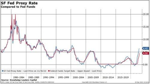
In a recent San Francisco Federal Reserve Publication titled “Monetary Policy Stance is Tighter Than Fed Funds Rate,” the authors argue that the “all in” policy rate is actually higher than the Fed Funds rate would suggest. They open:
“The Federal Reserve’s use of forward guidance and balance sheet policy means that monetary policy consists of more than changing the federal funds rate target. A proxy federal funds rate that incorporates data from financial markets can help assess the broader stance of monetary policy.”
How is the rate constructed? Per the Fed’s explanation:
“This measure uses a set of 12 financial variables, including Treasury rates, mortgage rates, and borrowing spreads to assess the broader stance of monetary policy. Using principal components, common movements among the 12 financial variables are extracted. The first three principal components are then mapped to levels of the federal funds rate, where the mapping reflects the pre-2008 correlations between them. Until December 2008, the mapping is nearly exact by construction; after 2008, the mapping from financial conditions to the funds rate diverges. This separation displays how the proxy funds rate responds to developments in financial conditions such as forward guidance and balance sheet operations.”
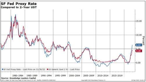
The SF Fed is kind enough to post the data behind the rate so I can download and analyze it. Below is a picture of the rate alongside the traditional Fed Funds rate.
The first, simple observation, consistent with the Fed’s study is that the proxy is considerably higher than the simple Fed Funds rate. This hasn’t always been the case, especially in the 2008-2014 period when the Fed was accumulating assets and providing dovish forward guidance.
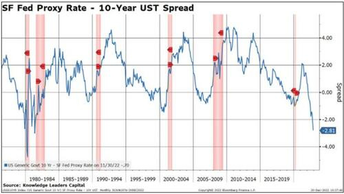
Next, let me use the proxy rate to calculate the yield curve inversion out to 10 years. At -281bps currently, this is the deepest inversion since 1981. Importantly, every single recession since 1980 has been preceded by a 1+% inversion, helping explain the cacophony of calls for a recession next year.
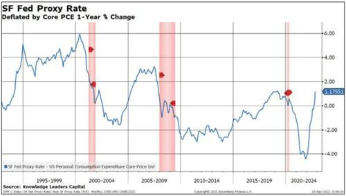
The Fed has repeatedly expressed the need to get the Fed Funds rate above the inflation rate to create a positive real fed funds rate. Mission accomplished! The SF Proxy rate deflated by the core PCE price index 1-year percent change is now +1.17%, nearly equal to the level that precipitated the last recession.
Perhaps the market senses that this elevated proxy rate is enough to cool the US economy significantly in the quarters to come, helping explain why 2-year US Treasury yields appear to be rolling over. Historically, once the Fed Funds rate hits the 2-year UST, that tends to signify the end of the tightening cycle.
The SF Fed wraps up its research piece with:
“Looking at the funds rate alone would suggest that policy is relatively looser than most rules would prescribe. In contrast, by accounting for the broader stance of policy, our proxy rate indicates that policy is tighter than most rules prescribe.”
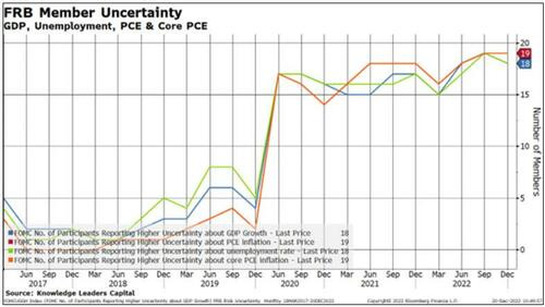
Perhaps reflective of the uncertainty of how this new proxy rate will impact the economy, the Fed, in its last meeting, was almost unanimous in its assessment of uncertainty regarding the path of growth, employment and inflation.
Which curve do YOU watch? Which curve is naughty or nice?
Finally, as the very last MARKET update of 2022, I’m certainly not alone in being grateful this one is about to be in the history / record books and rear view mirror. It has been worst for 60/40 since 2008. Full stop. Bloomberg,
… This year has been one of the worst on record for investors across a range of assets — and the classic 60:40 portfolio has been more of a hindrance than a help. A Bloomberg index mirroring the performance of such an allocation to stocks and bonds delivered 16% losses so far in 2022, the most since 2008. There are hopes for better times in the coming year, with Bank of America’s chief investment strategist Michael Hartnett among those predicting the portfolio will offer better rewards.
One key reason for optimism is that this year’s bond selloff means yields are meaningul again, restoring one of the key fundamental reasons for expecting the fixed-income part of the holdings to offer stable returns to balance the more mercurial performance that equities offer.
… THAT is all for now AND for the year … Thank you to all for stopping by and listening to my rants and transitioning from a front-row seat IN the bond market and to a more CIVIL role as spectator ... All the very best and a Merry XMAS, Happy Holidays and good wishes for a happy and healthy new year!! One last time for the year, I’m off to the day job…
I suppose it is possible the current flagging of bonds represents the end of the first "Tercio de Banderillas" barbing. If so, then there is yet plenty of thrilling blood sport for spectators before the "Tercio de Muerte" begins, and eventually climaxes, when the steel "estoque de verdad" is administered to the GOAT bond bull.
How many more times will the digital asset dip buyers and equity systematic-trend followers charge the "faena" of "muleta?" Till they have a date with the "descabello" (i.e., run out of helicopter money before the next drop arrives) for some I suppose. True believers, and believers in 'The Truth', die the hardest. It can only end one way in the financial markets for the 'Joan of Arcs', a swan dive into a medieval mosh pit: https://www.youtube.com/watch?v=TBhv8M8rDJc


Merry Christmas & Happy Holidays
I suppose it is possible the current flagging of bonds represents the end of the first "Tercio de Banderillas" barbing. If so, then there is yet plenty of thrilling blood sport for spectators before the "Tercio de Muerte" begins, and eventually climaxes, when the steel "estoque de verdad" is administered to the GOAT bond bull.
How many more times will the digital asset dip buyers and equity systematic-trend followers charge the "faena" of "muleta?" Till they have a date with the "descabello" (i.e., run out of helicopter money before the next drop arrives) for some I suppose. True believers, and believers in 'The Truth', die the hardest. It can only end one way in the financial markets for the 'Joan of Arcs', a swan dive into a medieval mosh pit: https://www.youtube.com/watch?v=TBhv8M8rDJc