Good morning … Chinese data overnight leaving something to be desired. In fact, you’ll note below, it’s not YET bad enough to be good but rather, bad is just bad … In as far as yesterday’s data here in the USofA, well, it produced banners like,
‘Stocks RISE as strong data EASES recession fears’ … Yesterday’s data,
ZH: Initial Jobless Claims Unexpectedly Tumbled Last Week, Led By TX & CA ZH: Q1 GDP Unexpectedly Revised Sharply Higher On Bizarre Surge In Net Exports
… the knee-jerk response,
ZH: Strong GDP Sparks Surge In Rate-Hike Odds: Bonds, Big-Tech, & Bullion Battered WolfStreet: Waiting for the Promised Recession: Economic Growth even Stronger than Feared, Treasury Yields Spike
Hike odds SPIKING putting paid, then, to JPOWs comments yesterday at SINTRA?
This all certainly shook up the rates Sno-Globe a bit BUT interesting to note my thick, triangulated crayon lines still standing …
Yesterday’s data DID, in fact, change lots (momentum) and perhaps changed nothing at all … WATCHING the daily TLINE and … that saying comes to mind wherein the trend is your friend until it bends? Here’s an early live look in at Mr. and Mr.s Bondbeat in the upcoming weekend as we study and then update some of the charts
AND … here is a snapshot OF USTs as of 715a:
… HEREis what this shop says be behind the price action overnight…
… WHILE YOU SLEPT Treasuries are cheaper and flatter, adding on to yesterday’s aggressive breakouts across front-ends (1y1y >4.03%) and real yields (5y RY >2.00%). It seems the EZ core CPI print at 5.4% (from 5.3% prior, but vs expectations of 5.5%) and UK GDP (0.1%QoQ) were enough to keep the bearish momentum intact across the frayed nerves in core markets, equity futures also powering ahead in spite of the terminal rate reappraisals (DAX +1%, S&P futures marked at +16pts here at 6:40am). The UST curve remains biased flatter with 2s10s scouring new moves lows at -104.5bps (close to the cycle inversion lows of -110bps), the belly modestly underperforming (2s5s10s +1bp). The DXY is slightly higher +0.1%, EM risk slightly underperforming, while Commodities are close to UNCH (CL +0.1%, XAU -0.1%, HG +0.5%, BCOMAG +0.8%). Flows are light and variable (for a month-end), volumes in USTs ~105% the 30d average, a 640k/01 TY block recently printing (looks bought) after the early London session saw real$ selling intermediates & TYs (closing cross-mkt tighteners).
… and for some MORE of the news you can use » IGMs Press Picks for today (30 JUNE) to help weed thru the noise (some of which can be found over here at Finviz).
From some of the news to some of THE VIEWS you might be able to use… here’s what Global Wall St is sayin’ …
With Chinese data out overnight — China Manufacturing PMI steady at 49.0 but Non-Manufacturing PMI falls to 53.2, lowest for the year so far — this first inbox item comes from one of the banks which recently passed the stress tests,
In last month’s PMI report (link), we noted that “given that the official annual growth target of ‘around 5%’ is not jeopardized, we maintain our minority view that authorities are unlikely to implement additional stimuli beyond what are already baked into our base case. In other words, the authorities will likely do enough to ensure achieving the official growth target, but not to support the more optimistic consensus outlook. We do anticipate a greater tolerance by authorities of a weaker RMB” (link). Since then, we have seen the consensus outlook on China’s annual growth decline noticeably (Figure 1), additional depreciation of the RMB against the USD, and a narrative that more bad news on the economic front would somehow force authorities to consider more aggressive and broad-based stimuli. The key question now is that “are the bad news bad enough to be good”.
The short answer is no, they are not. China’s June manufacturing PMI increased modestly to 49.0 from 48.8 in May, consistent with the consensus for a change, but still in contractionary territory. As expected, insufficient demand both internally and externally is once again reflected in the PMIs. (See Figure 2.) But does this contractionary reading jeopardize the “around 5%” growth target? No, at least not yet. Hence, by our logic, we do not expect broad-based stimuli beyond what are already incorporated in our 5.2% baseline outlook…
…Looking ahead, we expect authorities to focus more on currency stabilization, but do not see meaningful RMB appreciation from the current USDCNY levels in the coming month or two. We also do not count on the “national team” to reverse investor sentiment.
From China (and bad is bad, still), back here TO the US and a few words on stocks
SPX implied volatility has fallen to historically cheap levels relative to sector vol, suggesting fundamentals are in the hot seat as we head into the summer months. This is a potential risk for equities as EPS estimates continue to fall for most of the S&P 500.
Moving back TO a place I’m somewhat more comfortable … a note from a large German operation on monetary policy,
Updating our DB proxy rate to reflect the latest data suggests that the effective monetary policy stance has tightened on balance in recent months, even as the Fed kept the policy rate steady at 5.125% at the June meeting.
Higher equities, a lower term premium, and lower volatility have offset some of the tightening from a flatter curve, wider mortgage spreads and tight bank lending conditions. That said, the seven-tenths rise in our "all variables" proxy rate implies that overall financial and credit conditions have tightened by an additional hike above the two more signaled directly by the June Summary of Economic Projections.
Consistent with our recent work referencing policy rules, FCIs and market pricing, our analysis here suggests that the Fed is likely nearing a "sufficiently restrictive" stance, which they can plausibly achieve with another hike or two (see "An exercise in (sufficient) restraint"). That being said, should financial conditions ease and cease to be a net headwind on economic activity, the Fed may have to provide that tightening itself via further rate hikes.
This same shop offered another note which is interesting as the Fed is ‘nearing “sufficiently restrictive” stance’ … specifically thinking about the labor market,
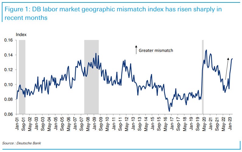
DB: Location, location, location: Why labor market mismatch is on the rise
Our geographic labor market mismatch index, which measures the divergence in job openings and unemployment across states, has risen sharply in recent months, approaching the record highs only observed during the GFC and pandemic. Determining what is behind this rise in mismatch could provide insights into how high the natural rate of unemployment may have risen (if at all) and whether or not the Beveridge curve is set to normalize.
We argue that while large domestic migration flows may have driven the initial rise in geographic mismatch in response to the pandemic, the recent rise is likely due to other factors. Most importantly, shocks impacting labor markets across different states as the economy normalizes are likely the most important factor recently. The clearest example of this is the significant relative weakening of California's labor market, which is exposed to the tech sector.
In isolation, divergent labor market shocks across geographies need not raise structural unemployment. However, when combined with the sharp decline in housing affordability, there could be a housing lock factor, akin to the post-GFC environment, in which more persistent labor market matching frictions could arise. To the extent these frictions persist, it could lead to a somewhat higher natural rate of unemployment and prevent a full normalization of the Beveridge curve.
PAUSE.
So at least then this firm gets it — higher rates to put halt on ability for one to move for a better job at risk of losing one’s SUB 7% mortgage payment. This will then require the Fed to acknowledge rates ARE restrictive enough already OR, you know, tighten a couple more times this year? Hmmmm. Lets think that through a bit … I’m quite certain a couple more rate hikes NOT going to be anything like a straw that broke the camels back, right? What could POSSIBLY go wrong? Aside from … well … things that are currently going wrong? Nevermind … please excuse dramatic pause as I continue to let this all settle in …
I NOW return to regularly scheduled programming, and what better way to jump back in than a note from one of the chosen ones,
Goldilocks: Recoveries, Renewed Hawkishness, and Renewed Downturns
■ We previously observed that peaks in longer-dated yields were reliable predictors of the bottom in equities in monetary-policy-driven drawdowns. The peak in the 10y yield, the peak in financial conditions tightness, and the trough in the S&P 500 all occurred in a two-week window in October 2022.
■ In past environments like this one, a peak in “hawkish policy shocks” has, like the 2- and 10-year yield, preceded or coincided with the equity trough, but with an even closer relationship. By that measure, the massive policy tightening shock that the market has seen this cycle peaked in October of last year, while the recovery in yields post-SVB has been driven primarily by a growth re-rating. ■ The history of monetary-policy-driven corrections suggests that the main risk for real renewed damage to risk assets is a renewed hawkish policy shock, and examining historical equity performance past the trough reveals two main things: there have been 1) no “double dips” in equities without an exogenous growth shock (COVID), and 2) no “double peaks” in hawkish shocks in the shorter term, but renewed hawkishness has led to renewed drawdowns over a longer period (1980 into 1982) ■ The lesson from history is that to return to the risk environment of last year would likely take a renewed hawkish shock like the 1980 to 1982 experience or a “classic” growth-driven recession. These are not implausible risks, but history shows that they are rare, particularly so soon after a large tightening episode. The data have been strong, and comments from Chair Powell suggest that the risks to the policy path are to the upside, but additional hikes at a more conventional pace as the economy holds up are not as unfriendly for risk assets as the policy environment of last year. ■ We expect more meaningful deceleration in inflation and for growth to remain slow but non-recessionary in the second half of the year. We think more likely than not that the environment from here will be moderately friendly for risk assets and conducive to lower vol. But we agree that a further hawkish central bank shift on inflation stickiness is the key near-term risk to hedge, although the bar to return to the "hawkish shock" driven environment of last year still looks to us to be quite high. With volatility in many equity indices, credit, and FX cheaper than it has been in some time, hedging via options may be an appealing way to protect against this outcome.
All this ivory towering commentary is swell but what’s it all mean? Why does it matter? Well lets turn TO a comment on 2yy and ones POSITIVE view of stocks,
… Two-year yields moved higher today by 0.14 percentage points, to 4.86 percent. That is the highest close for the year since March 9th (4.90 percent) and the 6th highest close of the post-Pandemic Crisis era. The only days with higher 2-year yields were all in early March 2023.
Last night we showed you this graph of 2-year yields and S&P 500 returns around various turning points for the former, but we think it is important enough to reflect on it again after today’s move. Its message is clear: when equity markets lose faith that they understand the terminal rate for Fed Funds and how long they will remain high (as reflected by 2-year Treasury yields), equity valuations suffer. When 2-year yields are stable or decline, stocks rally.
The current period of higher 2-year yields started on May 5th but, because the move has been measured rather than quick, the S&P 500 has managed a 6.3 percent rally over that time. Today’s move, combined with yields that are now getting back to 5 percent, is therefore troubling.
Takeaway: With so much of the current market narrative consumed by recession worries, its biggest blind spot may be the possibility that the Fed is still behind the curve on dampening economic activity and inflation. Two-year Treasury yields say this is a growing possibility. We remain positive on US equities, but are watching this situation closely.
AND so IF the Fed IS (still)behind the curve, what then are the implications for things like CREDIT SPREADS and the economy?
Thanks TO our friends at BBG (via ZH, thanks) continue to note how things are currently shaking out in this one,
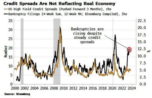
ZH: Credit Spreads And Real Economy Are Increasingly At Odds Authored by Simon White, Bloomberg macro strategist,
Idling credit spreads are increasingly unreflective of underlying credit conditions, leaving them exposed to a significant widening.
Credit spreads - investment grade and high yield - have in net terms gone nowhere over the last nine months. But this is concealing a worsening backdrop in the economy, less credit availability, and burgeoning credit stress.
Take bankruptcy filings. They are – and it’s not melodramatic to phrase it like this – soaring. The chart below shows the number of bankruptcy filings of
US
companies with more than $50 million of liabilities. At the current rate, they will soon exceed the 2009 and 2020 peaks.
The chart above also shows that normally wider credit spreads would presage a rise in filings, but that has signally not happened thus far.
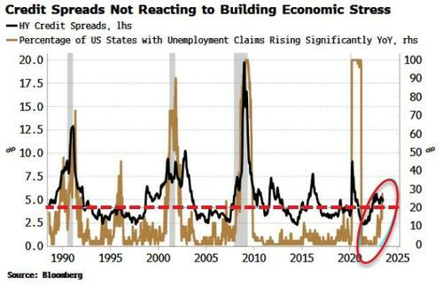
Also, credit spreads are not reflecting stress building in the jobs market. Typically, when we see an increasing percentage of US states whose unemployment claims are rising steeply, credit spreads rise too.
The pervasive worsening in the labor market is an early-warning signal of oncoming economic distress that credit spreads tend to pick up too. But again, that has failed to happen this time.
What’s behind this?
One likely culprit is speculation in equity markets is repressing volatility and this is flattering companies’ implied probability of default.
Speculation can keep markets aloft for longer, but they will become increasingly unstable.
When the party’s over though, credit markets face a rude awakening as they reprice to what is actually happening on the ground.
INCREASINGLY AT ODDS then would imply that ‘rude awakening’ but for now, we’ll continue whistling past the graveyard … you know, everyone just passed the stress tests and will be returning capital, so ALL IS WELL, right?
I’ll end with a couple / few hits / links for those of us VISUAL LEARNERS.
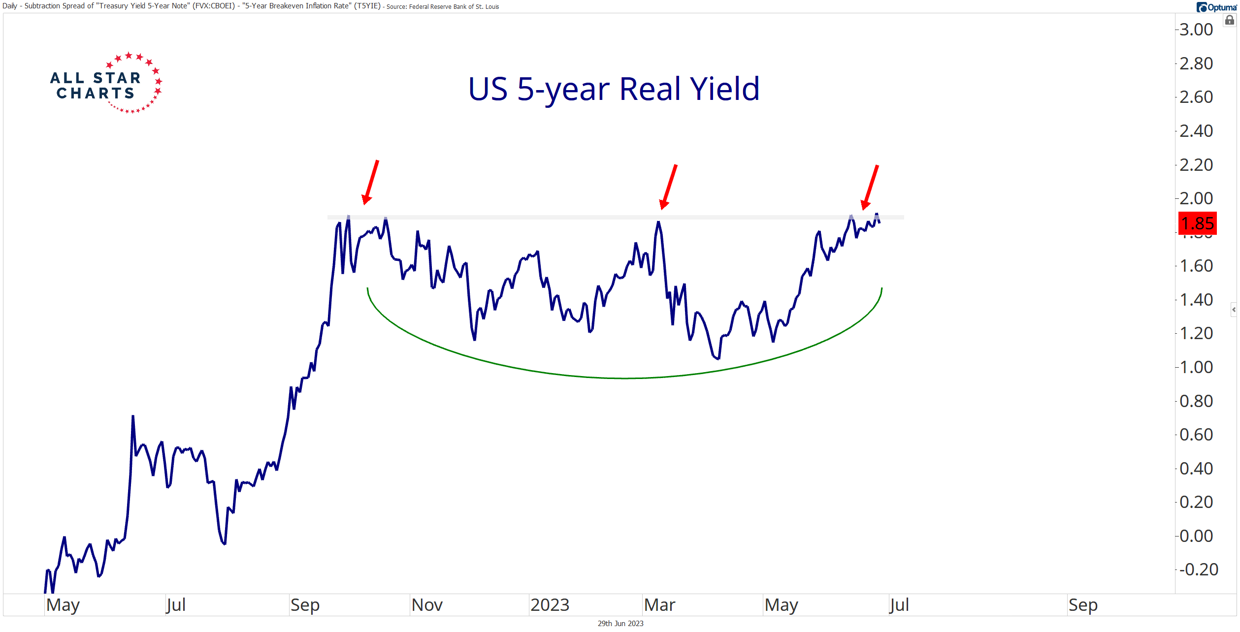
… But there’s one area of the fixed-income, commodity, and currency landscape poised to break free from this ambiguity…
US real yields!
Check out the US five-year real yield challenging a shelf of former highs:
Yes, we’re talking about yields. But I see a potential bullish continuation pattern.
Remember, we like buying smiley faces and erring in the direction of the underlying trend. Both point higher in this case.
While we can’t directly trade the US five-year real yield, it’ll reach levels not seen since late 2008 if and when it completes this base.
It’s difficult to say if nominal yields will follow. But it’s clear we’re in a rising rate environment.
Nominal yields remain elevated while breakeven inflation rates decline. Those are the conditions spurring the rise in real yields.
But fresh highs for yields don’t necessarily spell trouble for risk assets…
QUESTION — why CANT one buy REALZ? Thought we were talkin’ TIPS and last I heard one COULD buy / sell TIPS whenever one desired …
SCHWAB … TIPS yields are "real" yields, meaning they are already adjusted for inflation …
Nevermind. THEY are the AllStars of charts and I’m sure life, too. Moving along to some other charts.
CSFB: A basing process for US/Germany yield spreads and a top for EURUSD?
The 10yr US/Germany bond yield spread hit our core tightening target and major support at 103/100bps in late April (see our Q1 outlook) following which we have seen a steady move wider. This has now extended to test what we see as pivotal resistance at 139/146bps.
A sustained break above 146bps would in our view see an important base established which we would look to provide the platform for a more concerted widening phase, with resistance seen initially at 151bps ahead of 158.50bps…and higher we think in due course.
If we do see a base established in the yield spread as we look for, this would typically be associated with a broader topping process for EURUSD with medium-term support seen starting at 1.0585 and stretching down to 1.0501.
This report covers the Technical Analysis only for a time horizon of up to 3-months. Please note the House View is neutral EURUSD on a 12-month horizon.
For a bit more general walk through global market charts,
… S&P 500 may yet test resistance at 4513/35, but we continue to look for a cap here
… A direct break above 4,535 though would suggest we can see a further acceleration higher with resistance seen next at the 4,636 March 2022 high, potentially even the 4,819 record high…
… 10yr US Bond Yields ideally still stay capped at 3.85/3.91%
Another sidelined week leaves our immediate outlook unchanged with US 10yr Bond Yields still capped at key support at 3.85/91%, which includes a cluster of retracement levels, gap support and the downtrend from the 2022 high.
A sustained move back below the 55-day average and June low at 3.61/58% stays seen needed to mark a near-term top for a test of resistance at the year-to-date yield lows at 3.29/265%, which could prove a tough barrier at first. Bigger picture though, we still expect yields to move lower in the 2nd half of the year and maintain our core 3.00% objective.
Above 3.91% though would be seen to mark a more negative tone again, clearing the way for a test of the key 4.085% YTD high. Suspect we would still need to see a move above here to suggest we have instead seen a significant break higher, opening the door to a move back to the 4.325% high of 2022…
From this very last picture of 10yy TO the very front end of the curve,
June 29, 2023 The eurodollar futures contract is now no more, having been replaced by the new SOFR contract (Secured Overnight Financing Rate). For those unfamiliar with the term eurodollar, it is not a reference to the currency markets, but rather it referred to dollar-denominated time deposits in European banks. So you can think of it as LIBOR futures.
For a variety of reasons that are not important here, the CME decided to get rid of the eurodollar contract, and it spun up the SOFR as its replacement back in 2018. The sad part of this for me is that for many years I have gotten great insights from the Commitment of Traders (COT) Report data on eurodollar futures. The chart above shows how it gives about a 10-month leading indication of what short term interest rates are going to do. 10 months ago, this indicator was peaking, which tells us that a peak for short term interest rates is due right now, regardless of what Jerome Powell thinks…
… I have been working with the SOFR COT data since early 2022, seeking that answer. What I have found is that, yes, the SOFR COT data do provide an interesting leading indication for the stock market, and I have shared that with subscribers of our twice monthly McClellan Market Report and our Daily Edition.
There are two curious points about this relationship. The first is that the lag time which works best is about 13 months, instead of the 12 months that had worked before with the eurodollar COT data. And that lag time is a bit imperfect, with the stock market sometimes running a bit early or late compared to the model, and varying back and forth between early and late so I'm never sure exactly how to interpret its message.
The second curious point is that the relationship did not work at all during the first 3 years of the SOFR contract's existence. Correlation back then was horrible, but then starting in late 2021 it seemed to finally click and start working. It may be that the SOFR was so new at first, and not being widely adopted yet, so the message from the big banks about future liquidity flows was just not yet contained in these data early on…
Perhaps we’ll have a bit more time over the coming weekend to sharpen up crayons and look TO weekly, monthly and QUARTERLY charts but … THAT is all for now. Off to the day job…


Excellent work !!!!!!!!!