Good morning … (save for those still LONG of bonds … anyone? Bueller …?)
I know … I got it (actually ZH made the quip / point)
ZH: 30 Year Yields Hit Highest Since 2007 One Day After CNBC's Santelli Suggests 10 Year Could Go To 13%
30 Year Yields Hit Highest Since 2007 One Day After CNBC's Santelli Suggests 10 Year Could Go To 13%
This morning yields are once again rising, with the Treasury 30 year hitting highs of 4.856%, a level it hasn't touched since 2007.
The move sure seems to support a notion Rick Santelli laid out yesterday on Fast Money that bond vigilantes are back in full force. Santelli even predicted that 10 year yields could touch as high as 13%…
HERE is CNBC video clip (via TWITTER) — I was in the car on way to pick up Thing 3 from football practice when I heard this come across and nearly drove off the road!
Ok seriously, though, and speaking of accidents, bonds down stocks down where’s the hedge? DON’T say BITC please …
CalculatedRISK: BLS: Job Openings Increased to 9.6 million in August ZH: Market Pukes After Biden's Dept Of Labor Shocks With 5-Sigma Beat In Job Openings Which Soar The Most Since July 2021
We’ll deal with monthly and quarterly losses AND correlations breaking (ie from inverse to highly correlated where NOW bonds aren’t a hedge but rather an actual investment alternative … TINAs dead — until ‘long live TINA rides again)?
Further, perhaps these moves are simply a dose of common sense. A visual from BAML which I picked up from FinTWIT HERE
Think about the massive liquidity DRAINING going on and the lead up TO the drain is years of ZIRP/NIRP which shape shifted behaviors of ALL types (from where one lives to HOW one finances that life style).
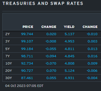
When the pendulum swings hard one way we know what happens and … here is a snapshot OF USTs as of 705a:
… HEREis what this shop says be behind the price action overnight…
… WHILE YOU SLEPT Treasuries are modestly lower but well off their earlier lows this morning (see discussion below) amid further curve steepening. DXY is lower (-0.2%) while front WTI futures are lower too (-1.8%). Asian stocks were sharply lower (KOSDAQ -4%), EU and UK share markets are mostly in the green however (SX5E +0.3%) while ES futures are showing -0.1% here at 6:50am. Our overnight US rates flows saw a sharp, 5bp rise in Tsy yields during Asian hours that eventually led to some dip-buying into the London crossover. During London's AM hours we also saw some dip buying (including in long P's) after 5% was hit in 30yr Treasuries. Overnight Treasury volume was quite solid (150% of ave) with 30yrs (189%) seeing relatively high turnover overnight…
… Treasury 10yr yields to show the potential Shooting Star being traced out today. A close today anywhere near opening levels (4.81% at 5:40am), or certainly below, would confirm the Shooting Star and a possible blow-off high (more on this in a sec).
… and for some MORE of the news you can use » The Morning Hark - 4 Oct 2023 and IGMs Press Picks (who CONTINUES to be sportin’ that new, fresh look) in effort to to help weed thru the noise (some of which can be found over here at Finviz).
From some of the news to some of THE VIEWS you might be able to use… here’s SOME of what Global Wall St is sayin’ (in a similar sorta way you’ll find content if you pay for ZH PREMIUM? askin’ for a friend as I never understood how they do it…)
Apollo - Why Is a Soft Landing Unlikely? (credit mkt + inflation = NOT a soft landing)
The Fed is in the process of cooling the economy down. The whole idea with raising interest rates is for us to buy fewer cars, spend less on our credit cards, and to build fewer factories.
The Fed’s ultimate goal is to get inflation back to their 2% inflation target. But with core PCE inflation currently at 3.9%, we are not there yet.
The desired slowing of the economy could come this Friday when we get the employment report for September.
The consensus expects 165,000 jobs in September, which is down from 400,000 jobs a year ago and 600,000 when the Fed started raising rates in March 2022.
What will happen in credit markets over the coming months once nonfarm payrolls finally move below the level consistent with population growth, namely, 100,000 jobs created each month?
Once nonfarm payrolls start moving below 100,000, credit spreads will widen because investors will take it as a sign that corporate earnings are about to slow down, see illustration below.
But with core PCE inflation at 3.9%, the Fed cannot turn dovish because it will look like the Fed no longer cares about inflation, which raises the risk of inflation expectations becoming unanchored. As a result, the Fed will continue to be hawkish even as the unemployment rate starts moving higher.
Once the recession finally begins, the Fed can turn dovish and start to lower base rates. But the costs of capital will not decline because at that time corporate earnings will be slowing, and therefore, credit spreads will likely be widening further.
The bottom line is that even if we get weak data and the Fed, after a few soft prints in nonfarm payrolls, starts turning dovish, the costs of capital will move higher. In short, the Fed controls the base rate but doesn’t control credit spreads, and that is the reason why a soft landing is unlikely.
Argus - With Shutdown Averted, Market Can Focus on Jobs
Friday's employment report will tell us if the job market is cooling enough to keep the Fed on the sidelines. We expect the Bureau of Labor Statistics (BLS) to announce that the unemployment rate remained at 3.8% in September and growth in nonfarm payrolls decelerated to 150,000 from 187,000 in August. The three-month average is 150,000 as June and July payrolls were revised lower by a combined 110,000 jobs. We expect growth in average hourly earnings to remain at 4.3% and average hours worked to be flat at 34.4 hours. The United Automobile Workers strike, which started on September 15, should not affect the September payrolls because the workers were not out of for the entire reference pay period used for classification. The Current Employment Statistics (CES) Strike Report from the BLS, normally released on the Friday before the jobs report, is a little known, but valuable resource on strikes involving 1,000 or more workers during a reference period. The number of job openings has declined from 12 million when the Fed started tightening in March 2022 to 8.8 million in July. We expect to see a continuation of this trend tomorrow when the BLS releases the Job Openings and Turnover Survey (JOLTS) for August. We also expect the JOLTS report to show that the number of people leaving jobs voluntarily (quits) is continuing to decline based on the perception that a tighter job market is making it harder to trade up to a better position. An indication of a more-balanced job market, where the Fed can stop raising rates, may be if the ratio of job openings to unemployed, which peaked at 2.0 in March 2022, continues to ease from 1.5 in July.
Barclays - August JOLTS: A setback for the soft landing camp
Job openings jumped to 9.6mn in August alongside minor upward revisions to July, while rates of separation, hiring, and quits were unchanged from July. This leaves the ratio of vacancies to unemployed unchanged at 1.5 at August's higher unemployment rate. The reversal reinforces the case for a November Fed hike…
… We retain our baseline call for another 25bp hike at the November FOMC meeting …
… With the hiring rate continuing to surpass the separation rate through August, we forecast that Friday's September employment estimates will point to still-resilient labor market conditions, with nonfarm payroll employment increasing another 225k.
BloombergBNP - US September jobs preview: Gradual cooling with eye on participation
KEY MESSAGES
A gradual deceleration in labor demand will likely keep pushing net hiring to new post-Covid lows. In September, we project nonfarm payroll growth at 150k (down from 187k prior) as the unemployment rate reverses to 3.6% from 3.8%.
A steady cooling in the pace of job creation -- on the order of about 30k per month year to date – would drive job growth into negative territory by February of next year. A non-linear deceleration due to a confluence of negative shocks in Q4 2023 could bring this timeline forward.
A large inflow of workers into the labor force in August may suggest money is becoming tight for Americans who feel more concerned about losing jobs and coming up with necessary funds in case of an emergency. The fall months could see a reversal in participation as the expiration of Covid emergency child care funding may lead to program closures.
… Survey data suggests that money is getting a bit tight. The recent Fed Survey of Consumer Expectations showed the probability of needing emergency funds increased to nearly the highest level since the Covid era, but the chance of coming up with this money fell to the lowest level since the crisis
DB - How the yield curve normally steepens before a recession
… in every recent US cycle, the yield curve had already begun to steepen from the inversion lows before the recession begins. So this is entirely normal even if we do see a recession. Indeed, in each of the last 4 cycles, the curve was out of inversion territory by the time the recession began…
5y5y OIS is up sharply over the past couple months, driven by increases in expectations of the long-run neutral rate and in term premia. The moves leave 5y5y around 4.25%, its highest level in a decade and approaching a range not seen sustainably since pre-2011.
Has the rise run its course? We don’t think so…
… Bringing it together – again, conservatively – with r* of 1.25%, long-run inflation expectations of 2%, and term premia of 1.3%, we get 5y5y OIS of 4.55%, suggesting scope for further increases from here.
5y5y has further to rise
Goldilocks - Job Openings Surprisingly Rebounded on Spike in Professional Services
Job openings increased by 690k to 9,610k in August, against expectations for a modest decline and driven by a 36% jump in the professional services industry. We have previously noted that the low response rate is likely to increase volatility, and alternative measures of job openings continued to decline in August. After incorporating today’s JOLTS data, our jobs-workers gap based on the JOLTS, Indeed, and LinkUp measures of job openings stands at 2.5mn workers in August.
Goldilocks - House Votes to Remove Speaker McCarthy
BOTTOM LINE: The House has voted to remove Rep. McCarthy as speaker. This has no immediate policy consequence, nor does it impact government funding, which was recently extended to Nov. 17. That said, a leadership vacuum in the House raises the odds of a government shutdown when the current funding extension expires. We continue to view a shutdown in Q4 as the base case, likely when funding expires Nov. 17.
JPMs VIEW - Assessing market risks after September’s sell-off
… Bear steepening might not be behind us given: 1) bond funds appear to be OW USTs, 2) the banking system continues to shed duration, 3) the JGB sell-off may have encouraged relative value flows away from other core government bond markets to JGBs, 4) global non-bank investors remain modestly OW bonds.
…there are a number of factors that have helped the tendency of bond markets to ‘trade long’. The first is that persistent inflows into bond funds has seen active US bond mutual funds exhibit an elevated total duration beta (Figure 821-day rolingbeta of20bigest aciveUS bondmutal fndmgers withepc oUSAgbnd index), i.e., an above average sensitivity of returns to US Agg returns, indicating overweights. Moreover, when we look at monthly returns of these active bond funds as well as components of the US Agg index, they appear to have shifted from credit overweights in July to overweights in USTs more recently.
… a fourth factor is that while our broader metric of global non-bank investors’ looks low relative to its post-Lehman averages (Figure 10Implied bonalcti byno-ak ivestor glbay), the fact that cash rates and Global Agg yields are now at pre-Lehman levels suggests there is less need for investors to hold longer-maturity bonds for yield. As a result, the pre-Lehman average may be the more relevant comparison, which would suggest if anything that global nonbank investors remain modestly OW bonds. Taken together, these four factors suggest the sell-off could have some further legs …
LPL - Q3 2023 in review (a lovely walk down memory lane…)
Equities took a hit in Q3 but are still strong to date…
Sectors take a hit, except energy…
The US outperformed developed and emerging markets…
Fixed income also struggled this quarter The fixed income market struggled in the third quarter of 2023 as interest rates rose. With the Bloomberg Aggregate Bond Index dropping 3.2%, the domestic bond market recorded its worst quarter of the year. The rise in Treasury yields has pushed up most other corporate and consumer interest rates. Long Treasury bonds led the way down as the yield curve steepened, plunging 11.8%. High-yield bond volatility increased as investors focused on credit spreads and default risk.
The Fed might have made its last rate hike of the year …
LPL Research’s latest thinking on asset allocation The STAAC maintains its recommended neutral equities allocation based on the Committee’s assessment that the risk-reward trade-off between equities and fixed income is roughly balanced, with stock valuations still elevated and bonds offering very attractive yields. The Committee continues to slightly favor developed international stocks over U.S. stocks due mostly to valuations and increasingly more shareholder friendly management teams in Japan, but currencies have not been helping and Europe has clearly weakened. Key risks to equities include overtightening by the Fed, further upward pressure on yields, broader military conflict in Europe, and escalation in U.S-China tensions.
Wells Fargo - Job Openings Rebound in August, But Turnover Settling Down
Summary Job openings have fallen over 20% since their peak last spring, but the jump in vacancies in August to 9.6 million suggest demand for labor is easing less rapidly than indicated by recent months' data. While openings remain far higher than the previous cycle peak, worker turnover suggests the jobs market is indeed settling down. The hiring rate and quit rate have returned to pre-pandemic levels, with improved retention helping to keep a lid on wage growth ahead. Yet layoffs also remain exceptionally low—consistent with the recent run of initial jobless claims—while the rate of quits and openings signal that, though the jobs market may be directionally weaker, it remains strong in an absolute sense.
Hurray! The bond market will be closed next Monday for Columbus Day. It has done enough damage in recent weeks. Today, the 10-year Treasury bond yield rose to 4.81% just because job openings edged up in August (chart). Nevertheless, we think the trend is still downward. The same goes for quits. Both are highly correlated with wage inflation as measured by average hourly earnings, which will be reported for September along with the employment stats on Friday. We expect to see that wage inflation also remains on a downward trend.
In any event, we don't think that the bond market's beef is with either the economy or inflation. The main issue is the widening federal budget deficit, which is increasing the supply of US Treasuries that must be financed. Demand should be boosted by the increase in interest rates to meet supply. We think that the 10-year Treasury bond yield should settle around 4.50%-5.00% if inflation continues to moderate as we expect (chart).
We've been expecting that the S&P 500 might fall to its 200-day moving average since early August and bounce off of it (chart). It's showtime! The 10-year yield may continue to rise toward 5.00% this week, which would probably push the S&P 500 below its 200-dma. Better-than-expected Q3 earnings should give the bulls some good news to work with.
… And from Global Wall Street inbox TO the WWW,
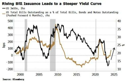
Bloomberg (via ZH) - Steeper Yield Curves & The Limits Of Correlation (steepening is thematic…)
The US yield curve should continue to steepen, with increased Treasury-bill issuance likely one of several supportive factors. In showing this, we’ll get to a deeper problem in markets analysis: the limitations of correlation.
Finally, after one of the deepest inversions yet seen, the yield curve looks like it is on a sustainable steepening path. I expect that trend to continue, with one of the supports - as I argued in a recent post - the increase in bill issuance. That prompted a riposte from Cameron Crise, arguing the correlation was low, and that anyway, correlation does not imply causation.
Both fair points, but they offer up the opportunity to look at correlation more closely, a tool used freely, frequently and often misguidedly in market analysis.
The chart that Cameron objected to is below. It shows the yield curve versus T-bills outstanding as a proportion of total government debt outstanding. As he pointed out, the correlation between the two series, at ~25%, is quite low.
But it is important to take the lead into account. Two lines on a chart with no lead may explain, but they don’t predict. Two series where one leads the other, assuming no spurious correlation, can predict - which has considerable more utility for investors.
In the chart above the T-bills series is pushed forward by six months. Recalculating the correlation using the series correctly offset shows it rises to 36%.
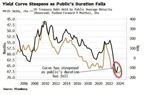
This is still on the low side, and doesn’t demonstrate causality. But we can better see the relationship by looking at the yield curve versus the average duration of Treasury debt held by the public. As the chart below shows, the public’s average duration of debt held has done a decent job of tracking the yield curve – with a nine-month lead – since 2008 and the GFC.
The correlation of the annual changes is -51%, with a t-stat of ~-5 in the linear regression. (As an important side note, we should always do correlations on changes not levels to reduce the impact of drift co-linearity).
Cameron put forward another relationship between net new duration (10y versus 2y issuance) and the yield curve, showing they are positively rather than negatively related, and having a still-on-the-low-side correlation of +44%.
Nonetheless, I prefer the average duration held by the public as a yield-curve predictor, not only due to the higher correlation, but as: a) it gives information on net issuance across the whole curve; b) it negates Federal Reserve ownership effects; and c) the relationship gives a lead rather than being coincident.
But there are two further important points to make.
The first is causality. As Cameron reminded us, correlation does not imply causation. A -51% correlation is not too bad, but even a 100% correlation would not imply causality. In fact, no mathematical technique can prove causality.
The only way to indicate causality is to have a causal theory. One offered here is that demand for shorter-term debt and bills is elastic, and when Treasury increases its shorter-term issuance, the extra supply creates more demand at the front of the curve relative to the back, and the curve steepens as average duration falls - as is happening today.
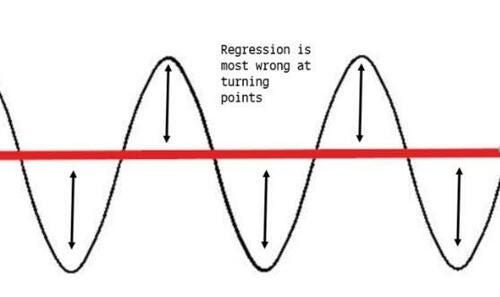
Yet an even bigger issue here concerns the limitations of the correlation measure itself that are often not appreciated. In markets, we are most interested in turning points. It is here where we get the most abrupt changes, and it is here where the consensus – which typically linearly extrapolates a trend – is most wrong. It is therefore at turning points we tend to see the biggest moves in risk assets.
But the standard way of calculating correlation (the Pearson coefficient) looks at an average of co-movements relative to each series’ mean. Two series may line up very well at major turning points, but that can easily get diluted by the rest of the data points in the set.
The de-emphasis of turning points can be seen most directly when we think about regressions. The ultimate aim from an investor’s standpoint is to find relationships that lead. Regressions enable us to forecast values for data series. But the most common type used – linear regressions – are ill suited for trying to predict all-important turning points.
Take a a simple sine curve. A naive regression would return a straight line through the middle. Not only is this unhelpful, it is “peak wrong” when you need it most, i.e. at the turning points.
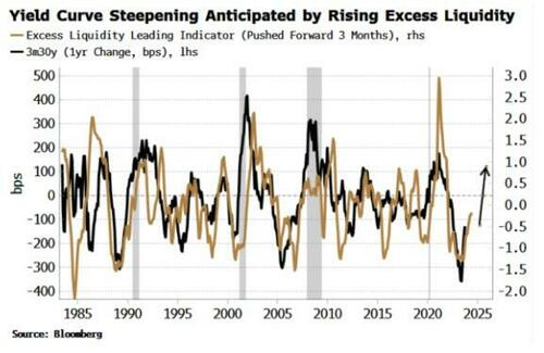
Back to today and the yield curve. As mentioned above, the average duration of Treasury debt held by the public is likely one influence on the yield curve at turning points. But it is important to not make assertions based on only one indicator. In this case a steeper yield curve is also intimated by the rise in global excess liquidity (real money growth minus economic growth).
Here, even though we can visually see many of the turns in excess liquidity lead the turns in changes in the yield curve, the correlation is under 35%. Yet the indicator has been more useful in anticipating the turning points than the low-ish correlation would infer.
Still, no relationships in finance and markets are mono-causal. There is reflexivity and there are feedback loops, as we get in any complex system. The aim of market analysis is to try to shine a light on partial relationships that hopefully help illuminate the bigger picture. As Niels Bohr, founding father of quantum mechanics, put it in the context of science:
“It’s wrong to think the task of physics is to find out how nature is. Physics concerns what we can say about nature”.
It looks like the yield curve should continue to steepen, based on the above analysis. The tacit caveat is that no relationship is perfect and there are no crystal balls. After all, if anyone had the holy grail to make money limitlessly, why would they share it?
Bloomberg - No one wants to remember 1987. Then there's 1916 (Authers OpED)
1987 And All That
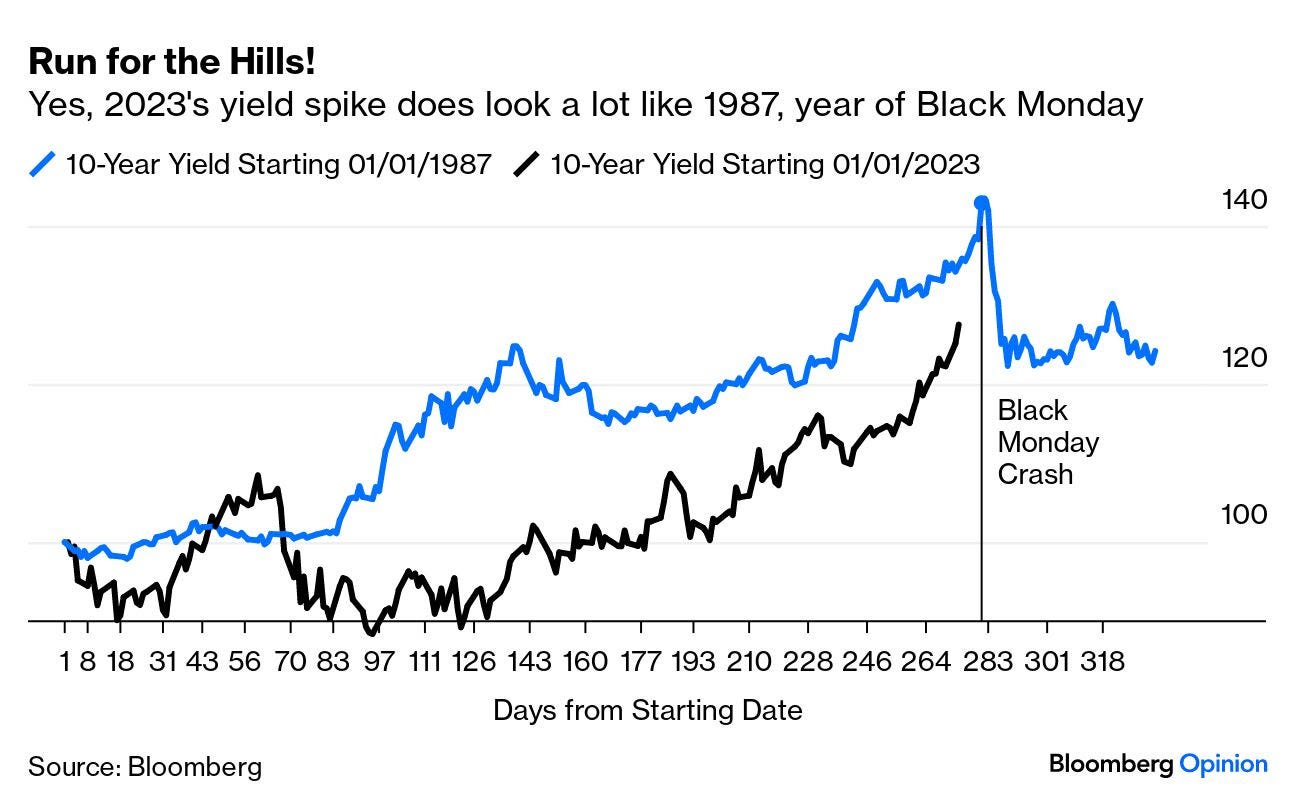
In financial circles, comparisons to 1987 are never welcome. The Black Monday crash in October of that year is still the single most terrifying day in market history; any suggestion that current circumstances are at all like the early months of 1987 is a little scary. So it’s disconcerting to find three references to that inauspicious year in my email inbox.
True, one is from Albert Edwards, the long-time very bearish investment strategist of SocGen. But he’s not the only one to see something reminiscent of 1987 in 2023’s rally for equities even as bond yields rose. “When I started in the business in 1987,” reminisces Steve Sosnick of Interactive Brokers, “bonds were mired in a bear market for most of the year while stocks rallied sharply. Until, of course, that reversed quickly.”
To illustrate just how quickly yields reversedon Oct. 19 whenthe stock market tanked 20%, and how similar it looks to 2023, here’s an overlay chart of the percentage increase in the 10-year yield from the start of each year:
Chris Verrone of Strategas Research Partners sees “shades of 1987.” Treating Sept. 20 (when Jerome Powell surprised the market with his hawkishness after an Federal Open Market Committee meeting) as a “breakout day” analogous to Aug. 27, 1987, when yields broke upward, he calculates that they peaked 33 trading days later on Oct. 15 at 10.23%. Today, he says, “that would be the equivalent of roughly 5% on the 10-year by early November.”
As for Edwards, he said:
The equity market’s current resilience in the face of rising bond yields reminds me very much of events in 1987, when equity investors’ bullishness was eventually squashed. And in a further parallel, currency turbulence in 1987 played a key role in exacerbating recession worries for an equity market priced for the start of a new economic cycle. Just like in 1987, any hint of recession now would surely be a devastating blow to equities.
For more horror chart porn, we can move on to equities…
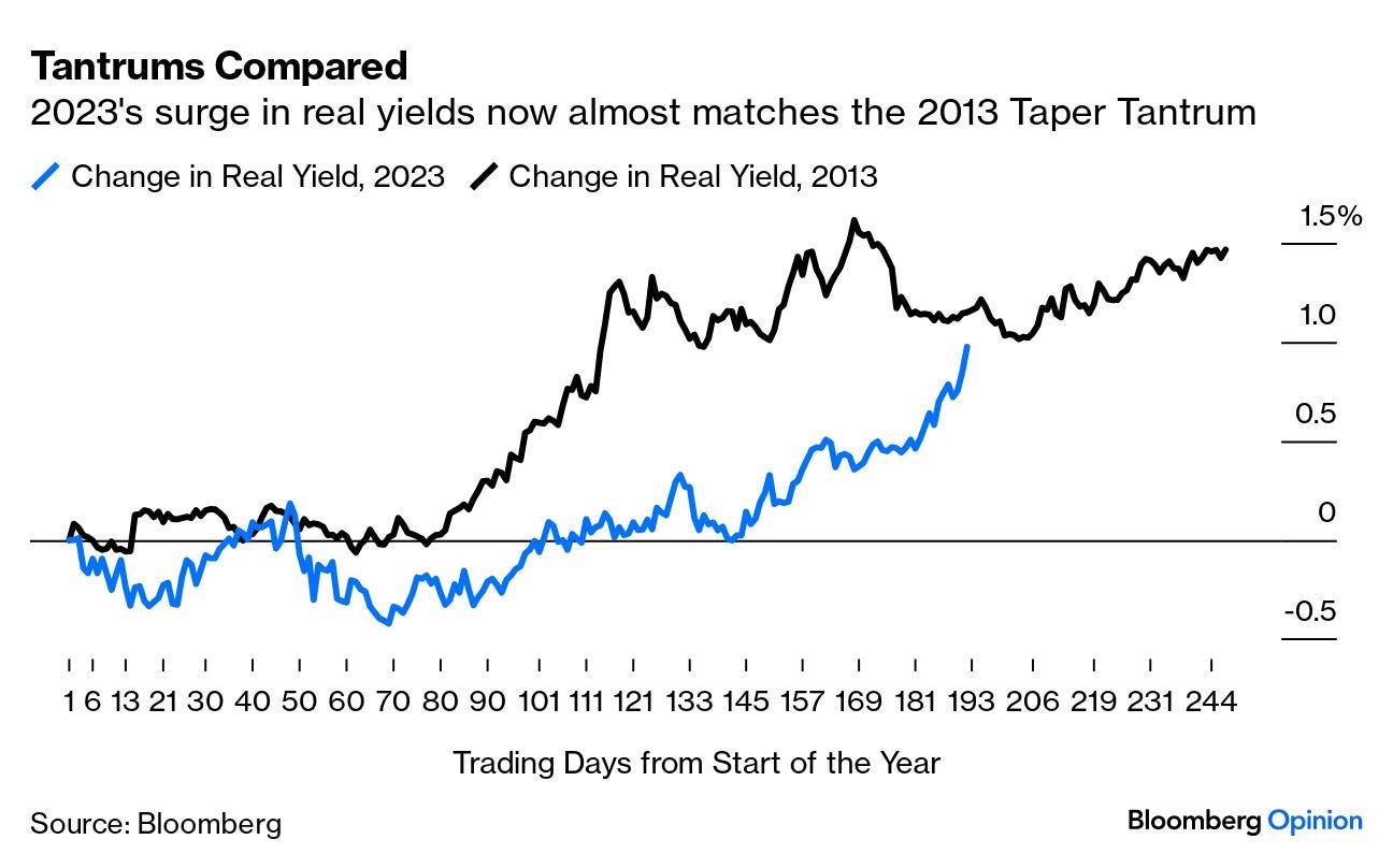
… This year’s rise in real yields is phenomenal, and is now fully comparable to the Taper Tantrum of 2013, when the bond market fell out of bed at the merest hint from the Federal Reserve that it might slowly start to buy slightly fewer bonds each month. At this stage, the 10-year TIPS yield has gained almost exactly as much as it had by the same point in 2013:
Note that we are now at the point when the first tantrum began to calm down. That was mainly because the Fed decided not to taper its bond purchases in September 2013, to widespread relief and surprise, and instead waited another three months. The lesson from this analogy would be that a spike in yields this dramatic must surely push the monetary authorities into being more lenient.
The lesson from all these charts is that it is indeed very unusual for stocks to perform so well when bonds are having such a bad time. It’s reasonable to expect that something will give soon. It doesn’t necessarily have to involve a stock market crash.
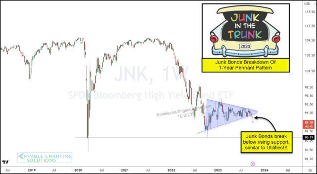
Kimble - Are Junk Bonds Sending Bearish Message To Stock Market?
There are several indicators to watch when assessing risk across the financial markets, and today we discuss one of the more important ones.
When junk bonds are performing well and in demand, that is a sign of “risk-on”. But when they are under-performing, that is a sign of “risk-off”. And the latter applies to today’s marketplace.
Below is a chart of the Junk Bonds ETF (JNK). As you can see, a year-long narrowing pennant pattern formed and appears to be breaking down
In the past, junk bond weakness has been followed by stock weakness; will it be different this time?
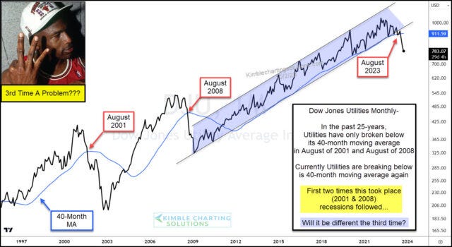
Kimble - Utilities Breaking Down: Omen For Stock Market and Economy?
In early September, we warned readers that Utilities were breaking down and that this would have an adverse effect on the stock market.
Since then, the breakdown has become more pronounced. And stocks have been under pressure.
Today we provide an updated “monthly” chart of the Dow Jones Utilities Index, highlighting the clear breakdown below its uptrend line and 40-month moving average.
Historical Precedent
The Dow Jones Utilities Index has broken below its 40-month moving average only 2 times in the past 25 years. And both times recessions followed.
This marks the 3rd time in 25 years that Utilities have fallen below this moving average line…. different results this time? Stay tuned!
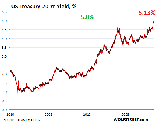
WolfST - 20-Year Treasury Yield Spikes to 5.13%. Yield Curve Gets Ready to Uninvert. Juicy Yields Tempt, but Bloodbath May Not Be Over
… Over the past two weeks, the 20-year yield has spiked by 56 basis points. When bond yields rise, bond prices fall, and so this has been a bloodbath for existing bond holders. Future buyers are ogling the juicy 20-year yields and are licking their chops. But they don’t want to get caught up in the next bloodbath either. Because it has been one bloodbath after another, interrupted by sucker rallies.
The 20-year yield has now nearly caught up with the two-year yield, which rose to 5.15%, putting this portion of the yield curve within a hair – within just 2 basis points – of uninverting.
The 10-year Treasury yield jumped 12 basis points today to 4.81%, the highest since August 2007. Over the past two weeks, it has spiked by 49 basis points.
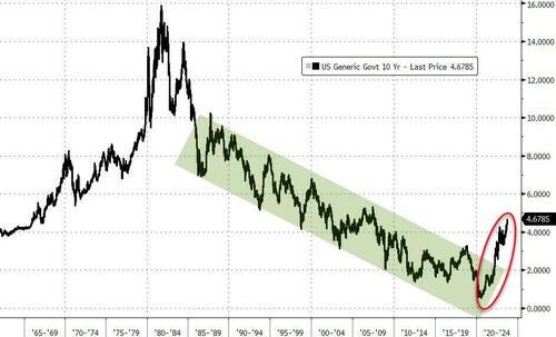
But wait… We’re just not used to these yields anymore. Back in the more normal times before QE, the 5% range was pretty common and low-ish even. For most of the 1990s, the 10-year yield was above 5%. So here is the long-term view of the 10-year yield:
… Future bond buyers are ogling this instrument. And they’re ogling those among them who tried to catch it over the past year and got their fingers cut off. If the Fed hikes one more time, and if the yield curve gradually uninverts, long-term yields would be headed over 6%, and that would produce another bloodbath.
Junk in the Trunk! LOL....trying to be delicate now, I work w/a lot of, shall we say, Urban Women, so I think more Queen's Fat Bottom Girls in the Junk in the Trunk context!


Agree with your commentary...
Wish I could trust the BLS's numbers...
Utilities, forecasting IRs peaking ???? I hope..
Great read !!!
Right on point.....
Junk in the Trunk! LOL....trying to be delicate now, I work w/a lot of, shall we say, Urban Women, so I think more Queen's Fat Bottom Girls in the Junk in the Trunk context!