HERE is the link to the full publication where you’ll find several fun-ter-taining eyecandy infographics. This one stood out to ME …
…Nine Years' Worth of Sales in 21 Months
It took nine years in the prior cycle to match the percentage increase in sales that retailers have experienced in just the past 21 months. Since retail sales are reported nominally, this cycle's surge gets a big lift from inflation, but it is also true that the demand surge is playing a role in driving prices higher. That is a perfect segue to our next favorite chart...
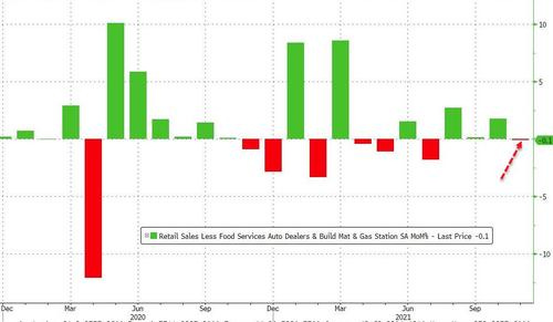
…Most notably, Retail Sales 'Control Group' - the data that feeds into GDP - actually shrank 0.1% MoM (massively missing the +0.7% expected)
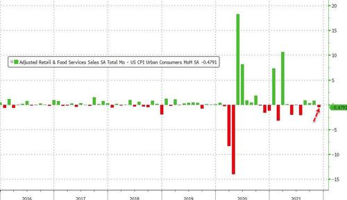
Finally, remember that retail sales are reported on a nominal basis and thus it is unclear how much of the rise is simply sue to inflation. The chart below - while overly simplistic given the vastly different weighting schemes - attempts to adjust retail sales monthly change for the shift in CPI. The picture is quite different, as 'adjusted for inflation', retail sales dropped in November...
Enough of ReSale Tales (or FAILS if you wish).
The WFC site has a few more including one for those reaching for yield as far and wide as Chinese HY (ie property) debt …